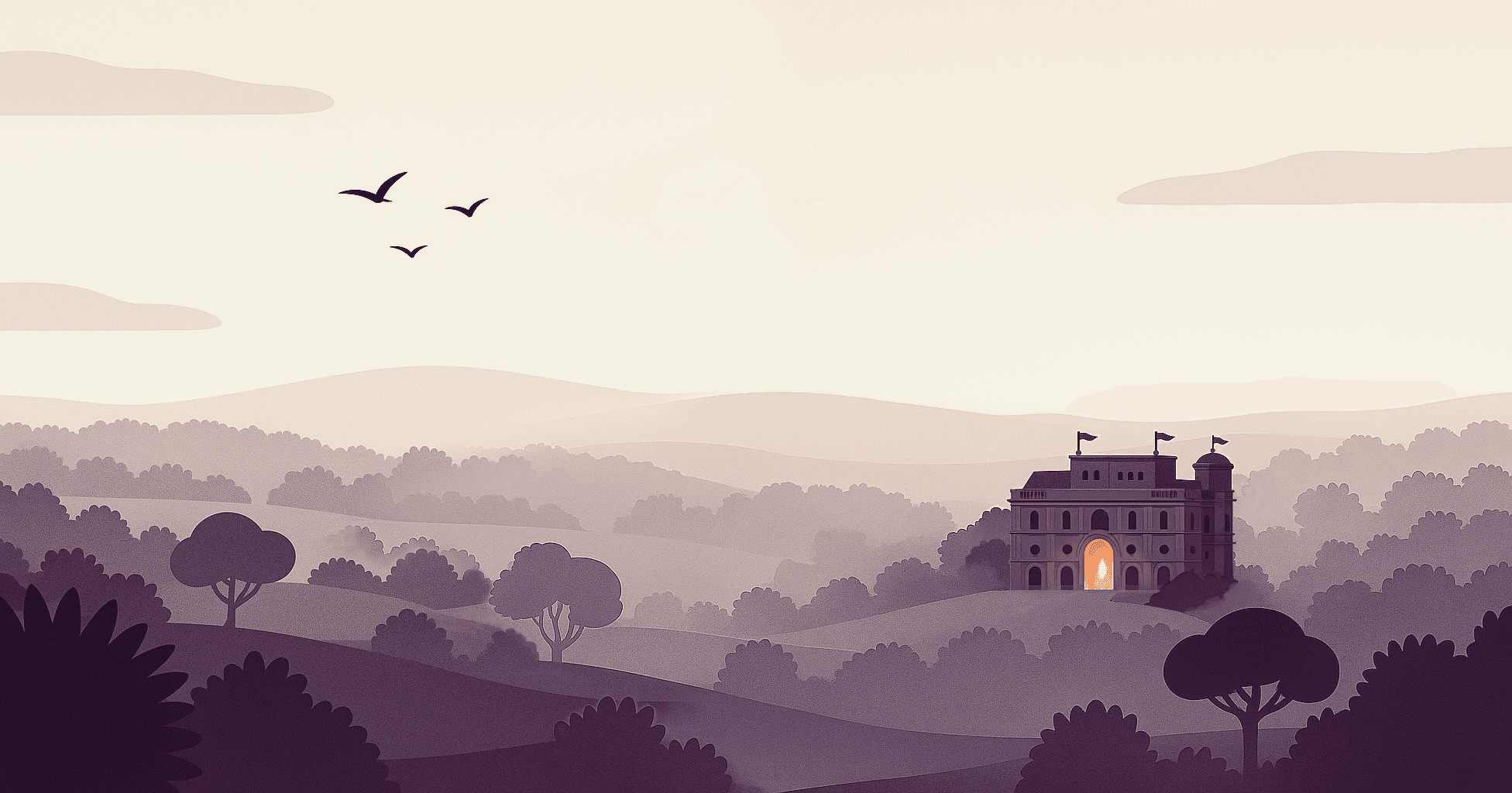
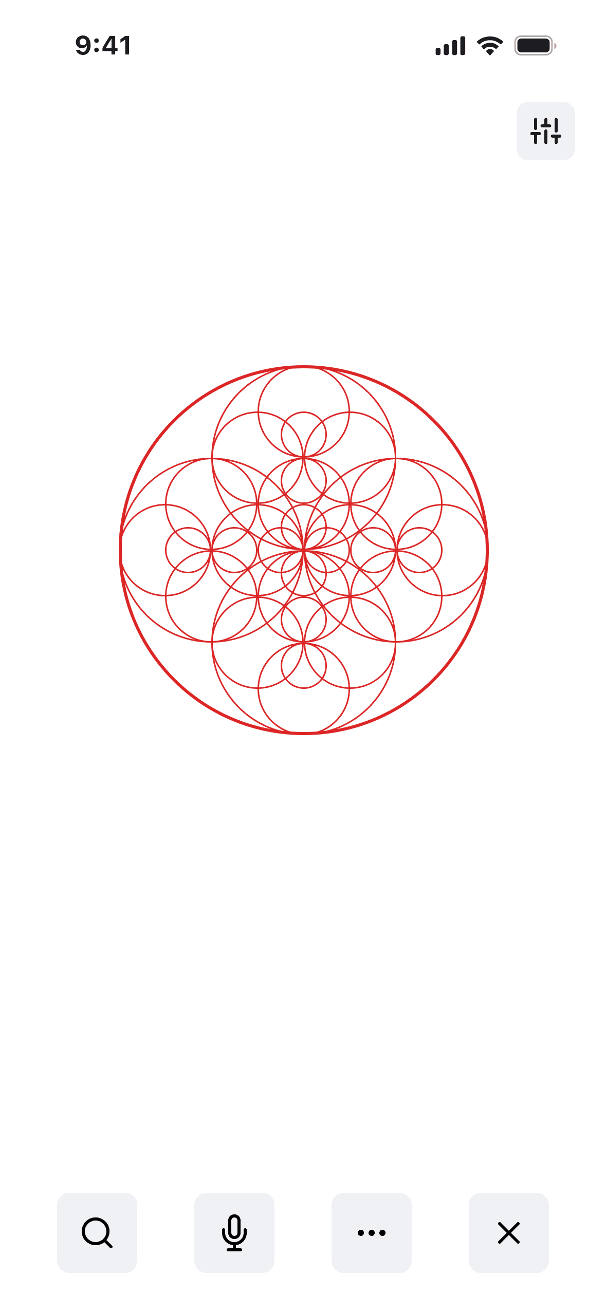
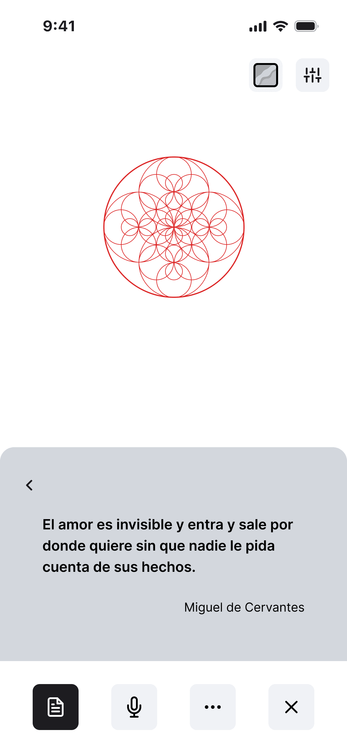
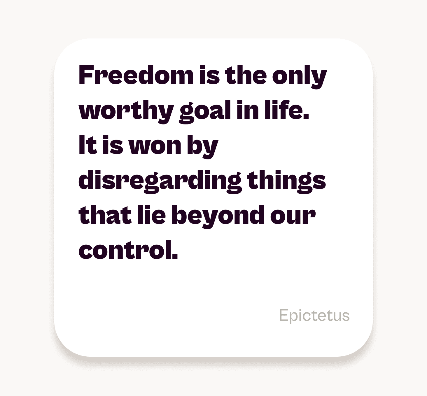
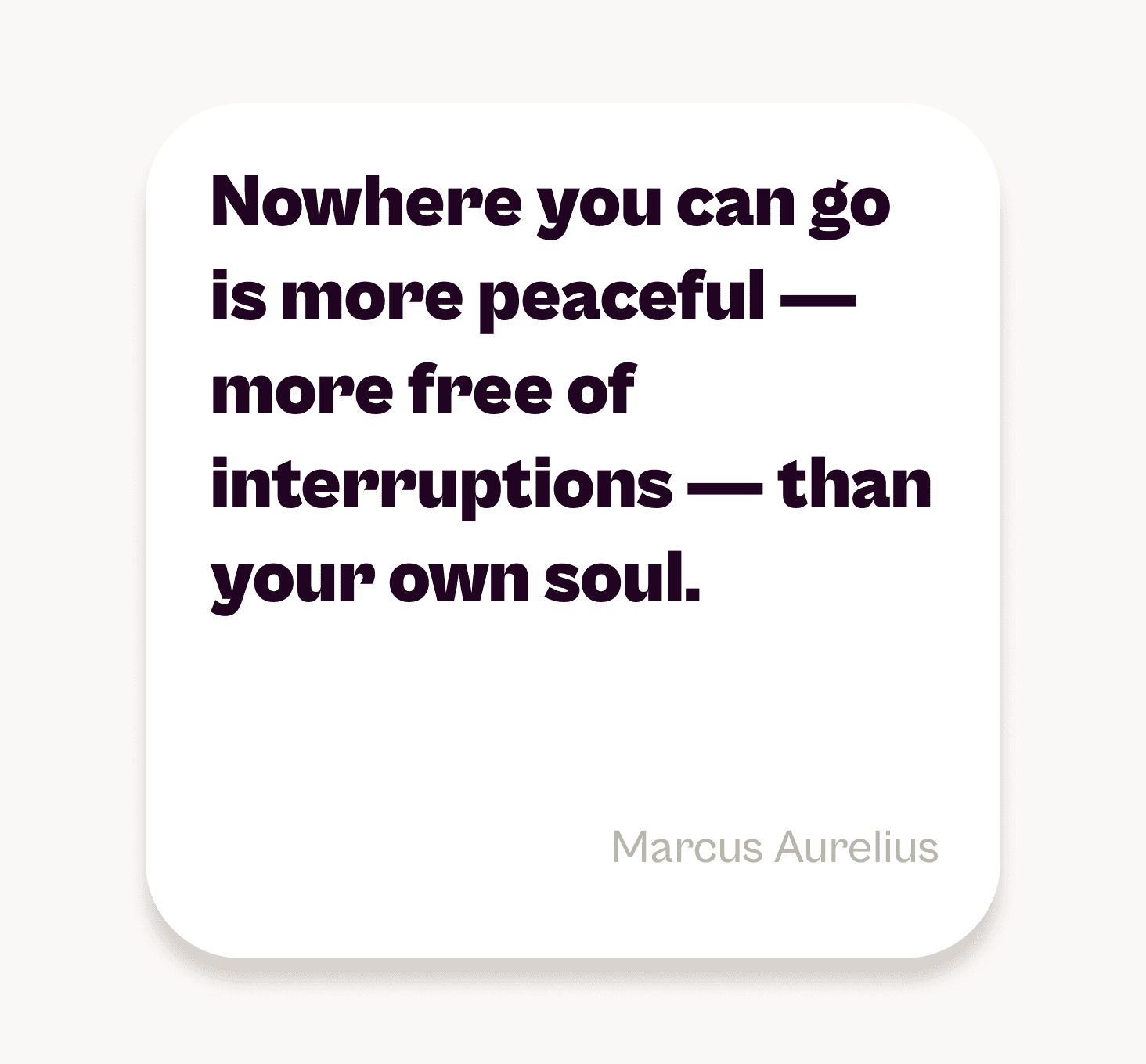
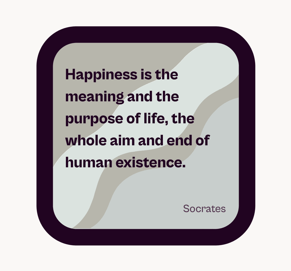
Echoes is a mobile app designed to collect and explore philosophical and literary quotes from great thinkers. Its purpose is to offer a serene and visually harmonious space to slow down, reconnect with wisdom, and find calm in meaning.
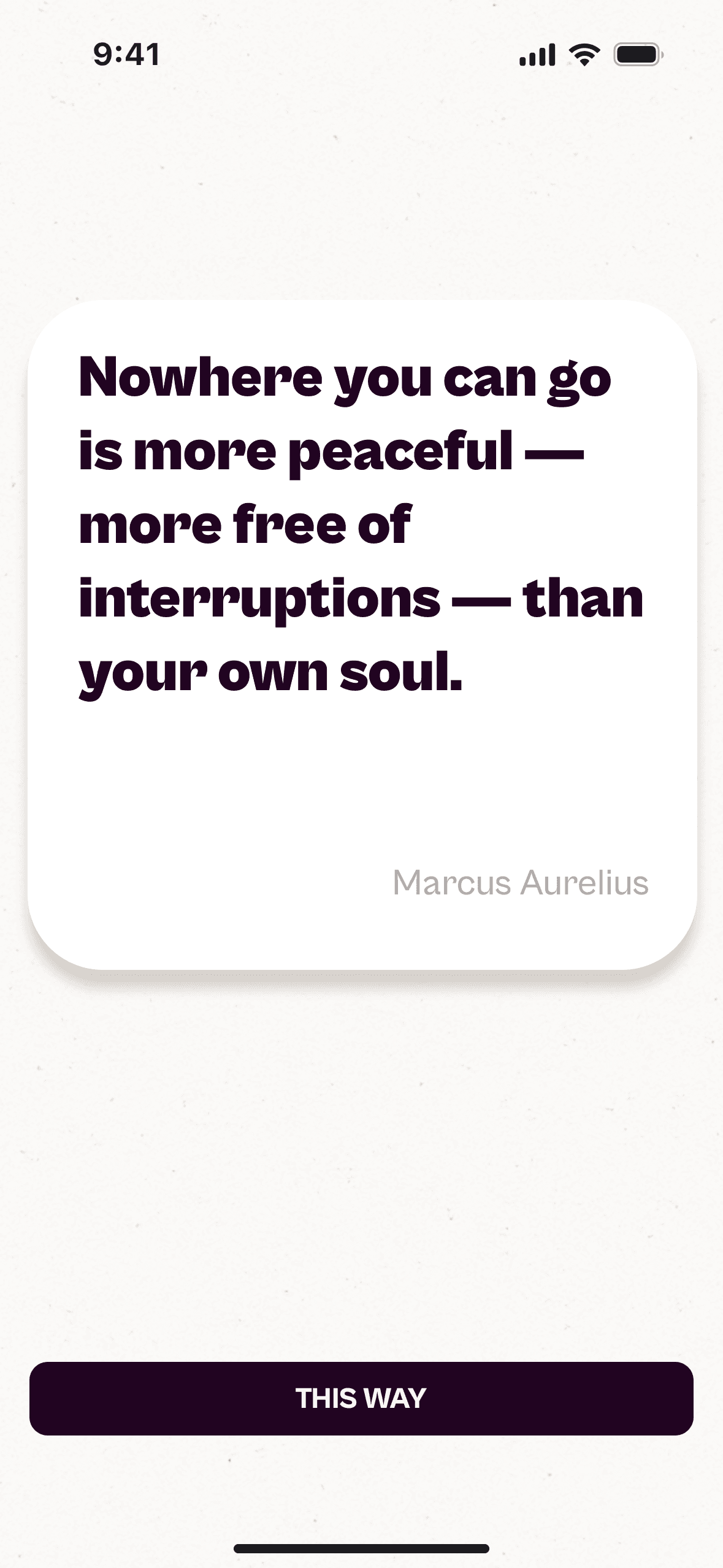
Each quote, called an Echo, is a fragment of timeless knowledge. The project investigates how a balanced visual experience and a gentle interaction can foster mindfulness while discovering inspiring ideas. It also promotes a genuine form of connection between users, without likes, metrics, or comparisons, in an environment that values reflection and authenticity over performance.
Role
Context
In the age of hyperconnection, attention has become a scarce resource. Endless notifications, infinite scroll, and metrics-driven design have turned technology into a constant stream of stimuli. What was meant to unite now fragments: connection has become exposure, and information, noise. In response to this digital fatigue, a new sensitivity is emerging — one that values Digital Wellbeing and Calm Technology : experiences that respect human time and return control of attention to the user.
Problem
Beyond information overload, algorithms tend to reinforce biases and beliefs, enclosing people within content bubbles. Social platforms reward immediacy and punish doubt, reducing the complexity of thought. Recent reports indicate that around one-third of users, especially from Gen Z, are distancing themselves from overstimulating networks and seeking quieter, more controlled forms of interaction. The need is not for more information, but for meaning, pause, and contrast.
Project Goal
Echoes was conceived as an editorial refuge where thought can breathe. Its aim is to explore how calm design —visual, typographic, and interactive— can offer an introspective, noise-free reading experience.
At the same time, it seeks to foster a more human form of connection between users: one based on the affinity of ideas rather than comparison or instant reward.
A space to share thought without competing for attention. In contrast to polarization and speed, Echoes stands as an exercise in balance between clarity, contemplation, and authentic connection.
“A growing share of Gen Z users now prefer apps with low-stimulation modes.”
Research Overview
The research combined desk research and trend analysis, complemented by 4 short interviews. It focused on understanding how people experience digital overstimulation and how they try to preserve calm, privacy, and a sense of meaning in their online lives. These early insights helped shape initial design assumptions before defining the product direction.
Insights
Return to the analog
Cultural communities
Leaving hostile networks
User Personas
Three archetypes emerged from the research, representing distinct ways of navigating today’s digital landscape.
Points of View
From the research emerged three key perspectives that summarize how users relate to digital overstimulation and what they long for in a calmer digital world.
1
Users feel mentally saturated by the constant rhythm of digital life. They crave spaces where they can pause, think, and reconnect with themselves without pressure to perform or produce.
2
People are tired of performative exposure and superficial interaction. They long for communities built on curiosity, shared meaning, and emotional safety rather than metrics or visibility.
3
In a culture of overstimulation, technology should slow down and help users recover balance and depth — becoming a medium for clarity, reflection, and authentic presence.
How Might We
From these perspectives emerged three key questions that guided the definition of the problem and the direction of the design process.
1
How might we create a digital space that helps users find refuge, reconnect with themselves, and discover ideas that strengthen their inner power — free from the constant demand for performance?
2
3
From these questions came the project’s direction: to create a digital space capable of restoring the calm and meaning that hyperconnection and hostile environments had eroded. The challenge was to embody those values without becoming yet another social network.
Guided by the insights, I explored different ways to represent reflection and serenity in a functional digital form. Collecting philosophical quotes emerged as the simplest and most universal way to invite thought without noise.
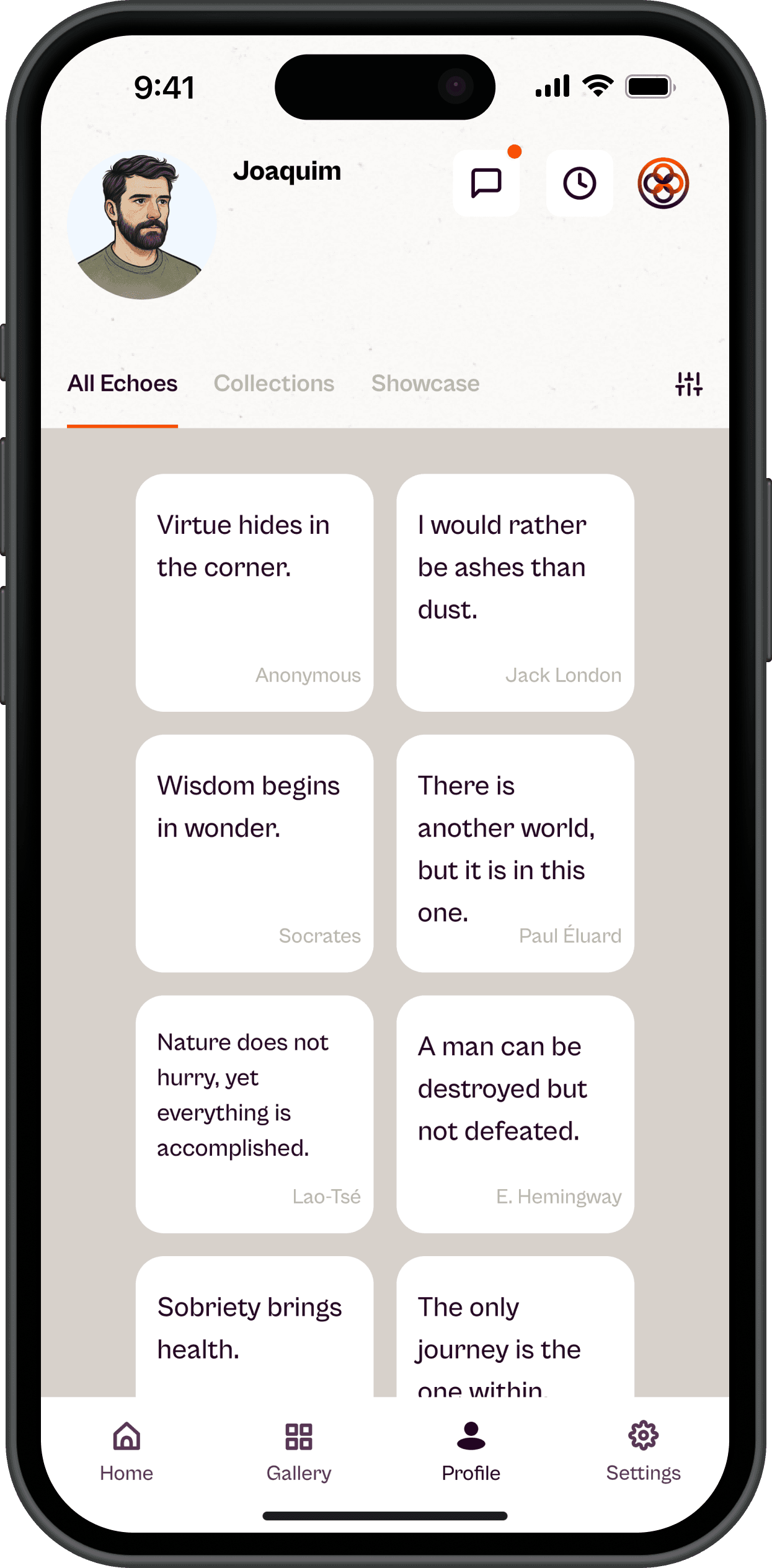
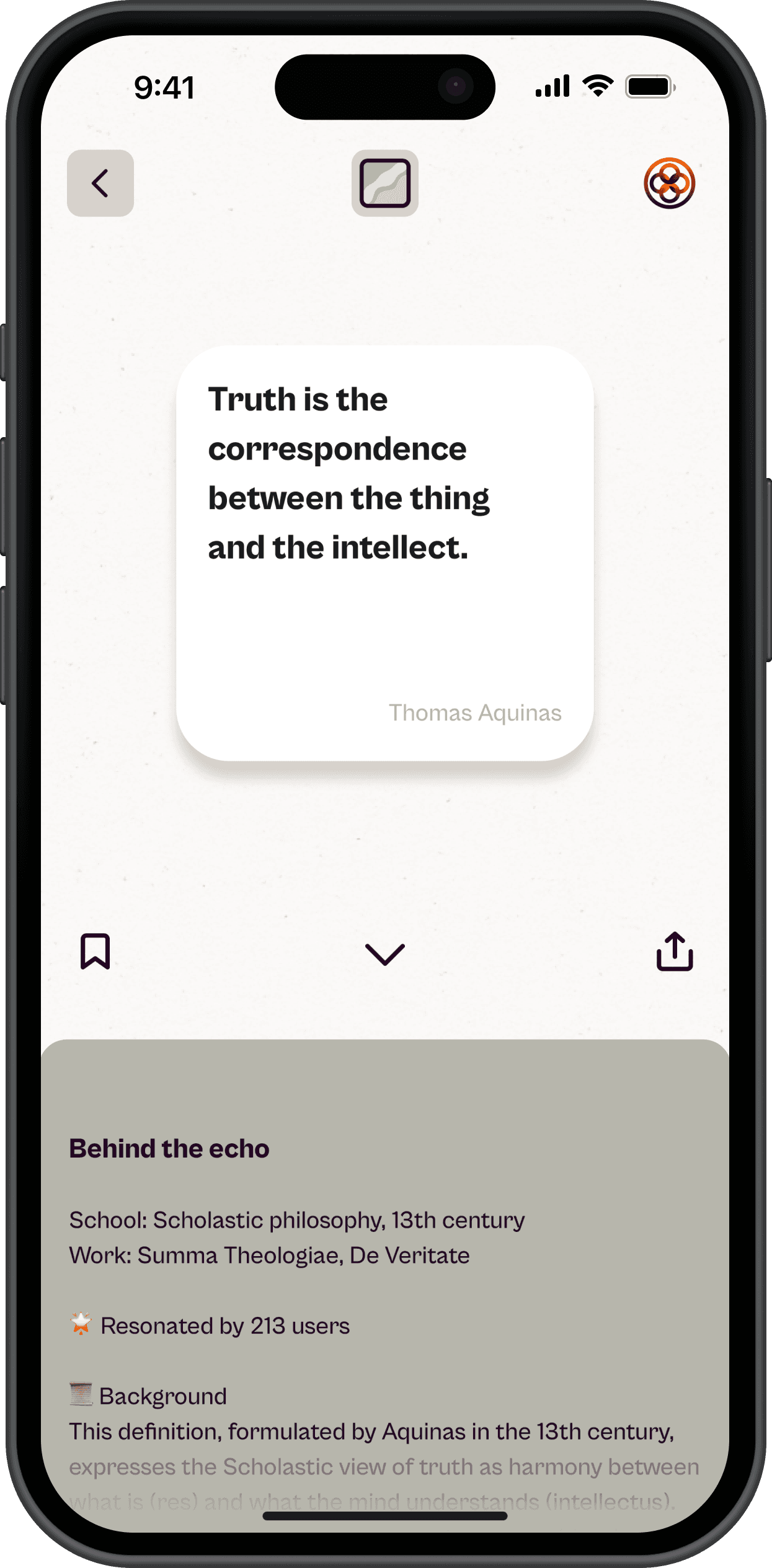
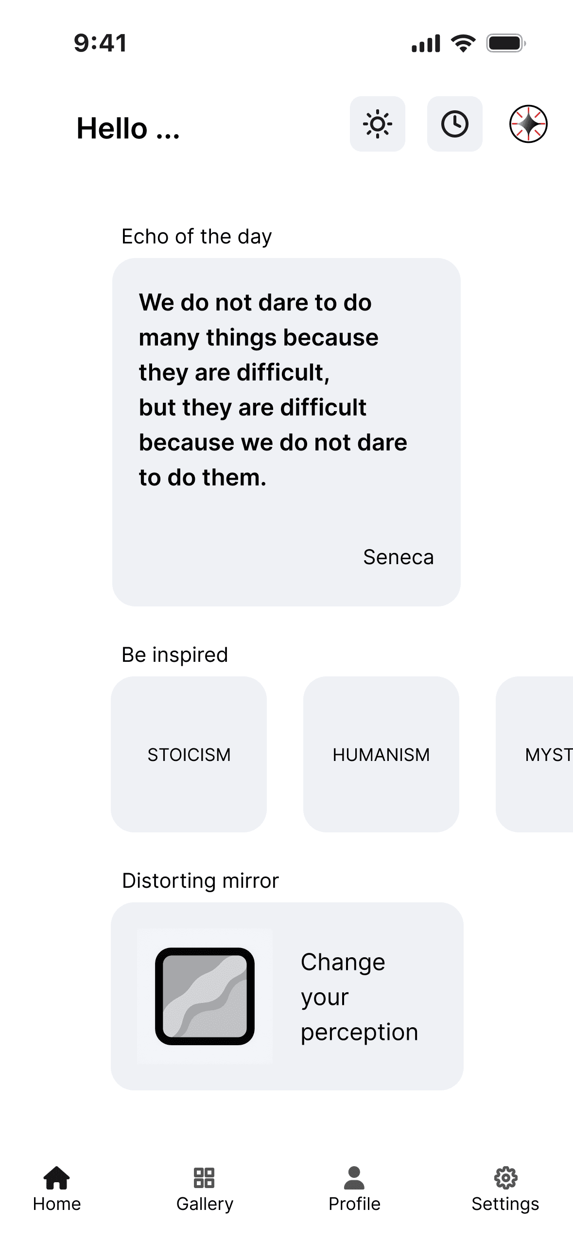
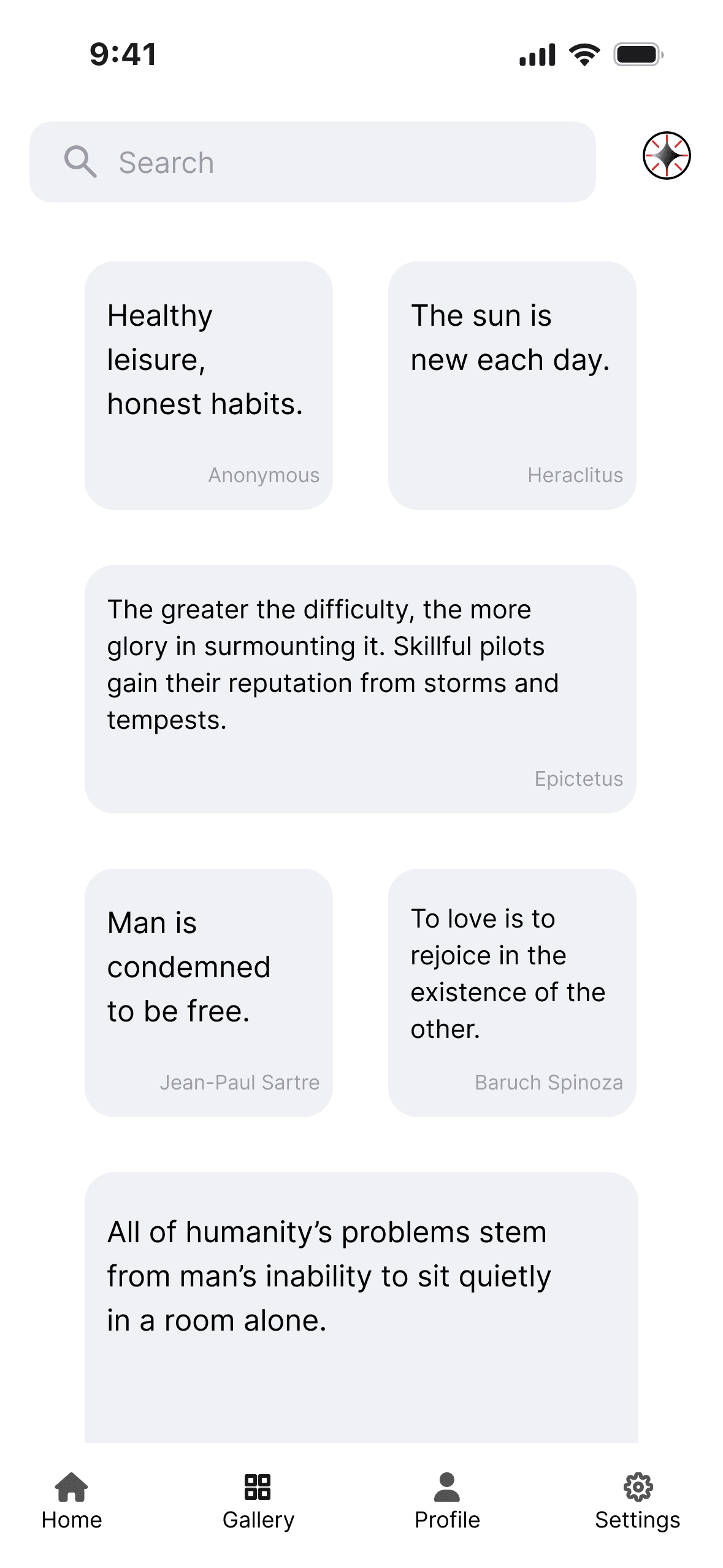
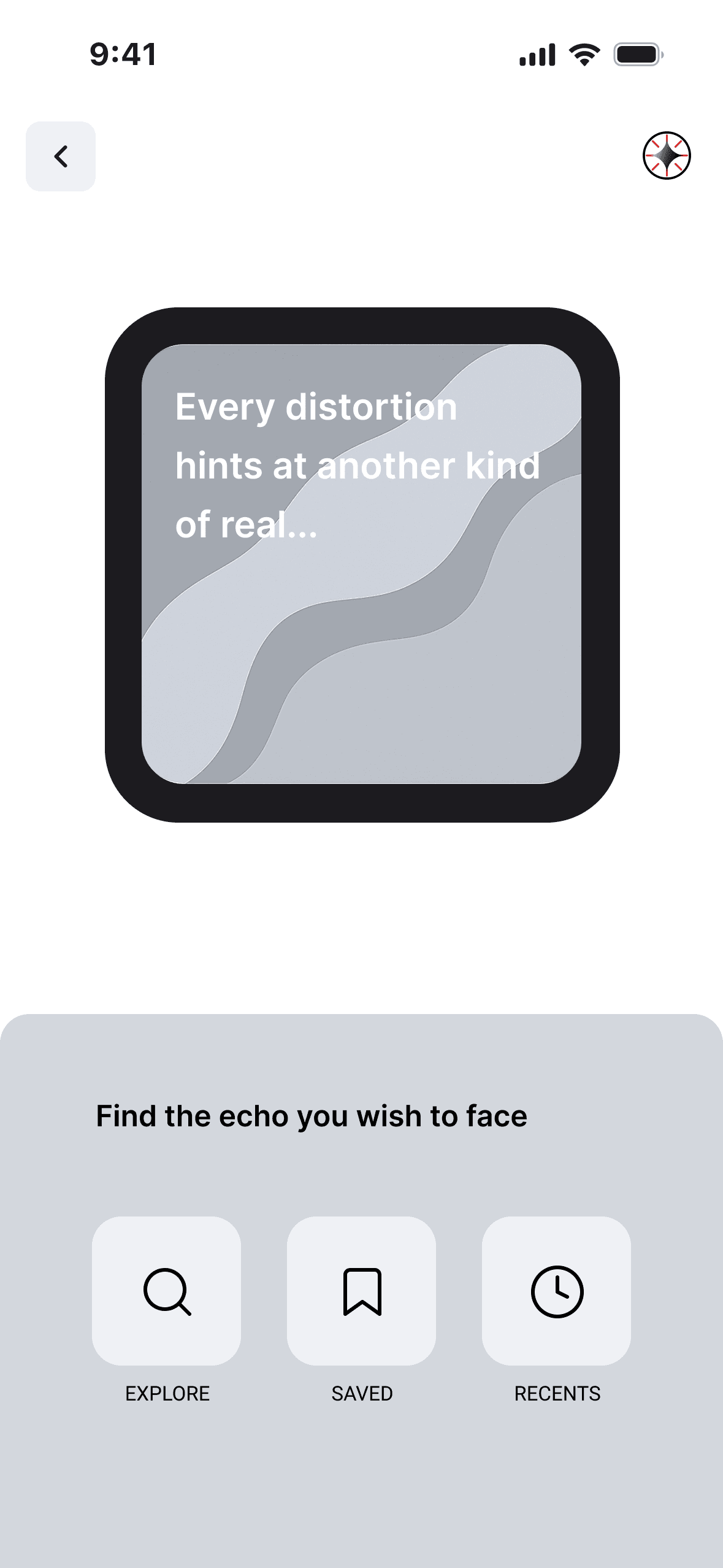
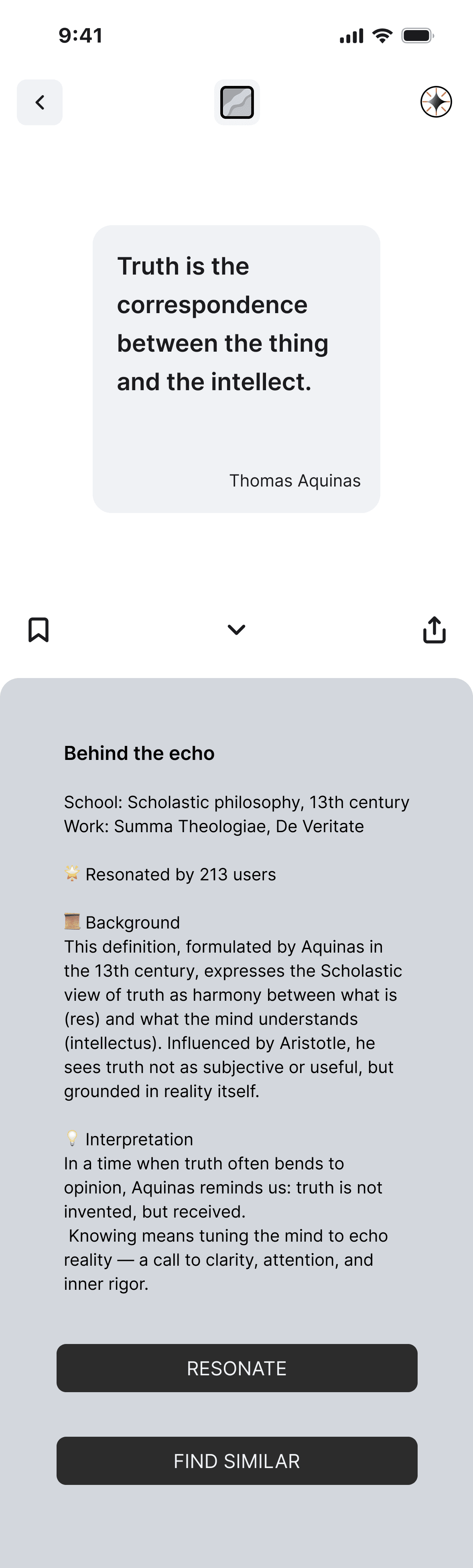
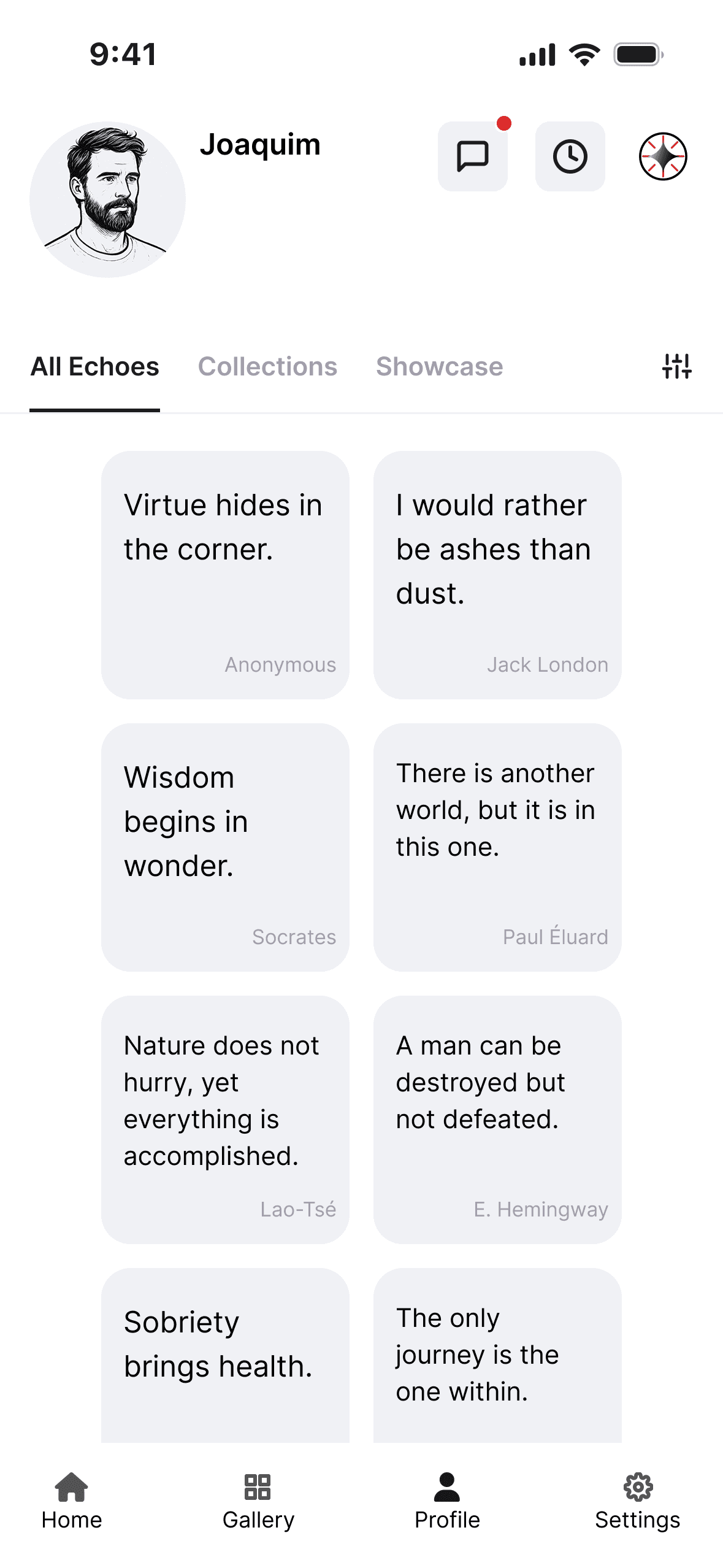
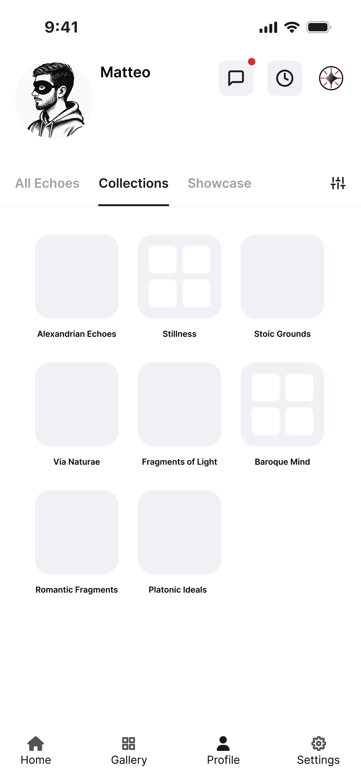
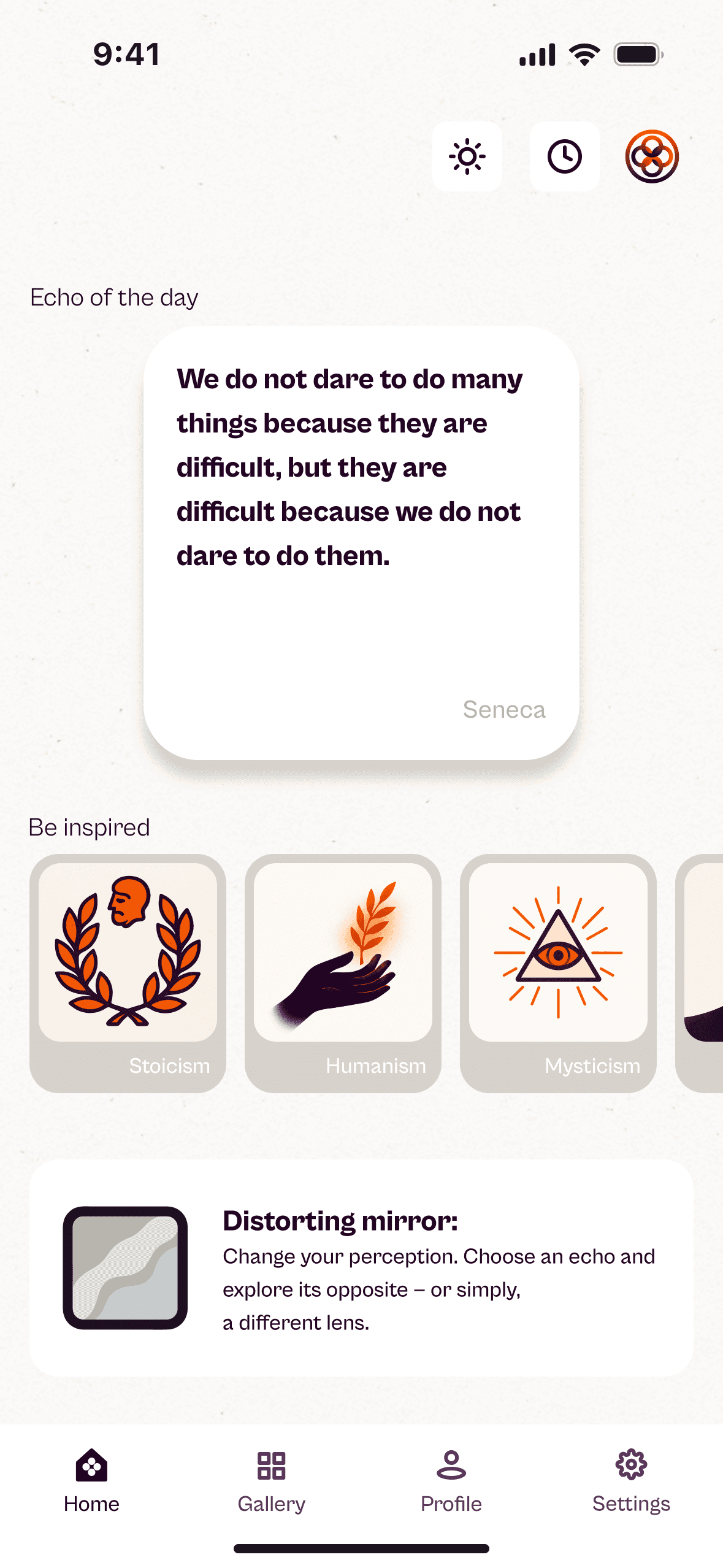
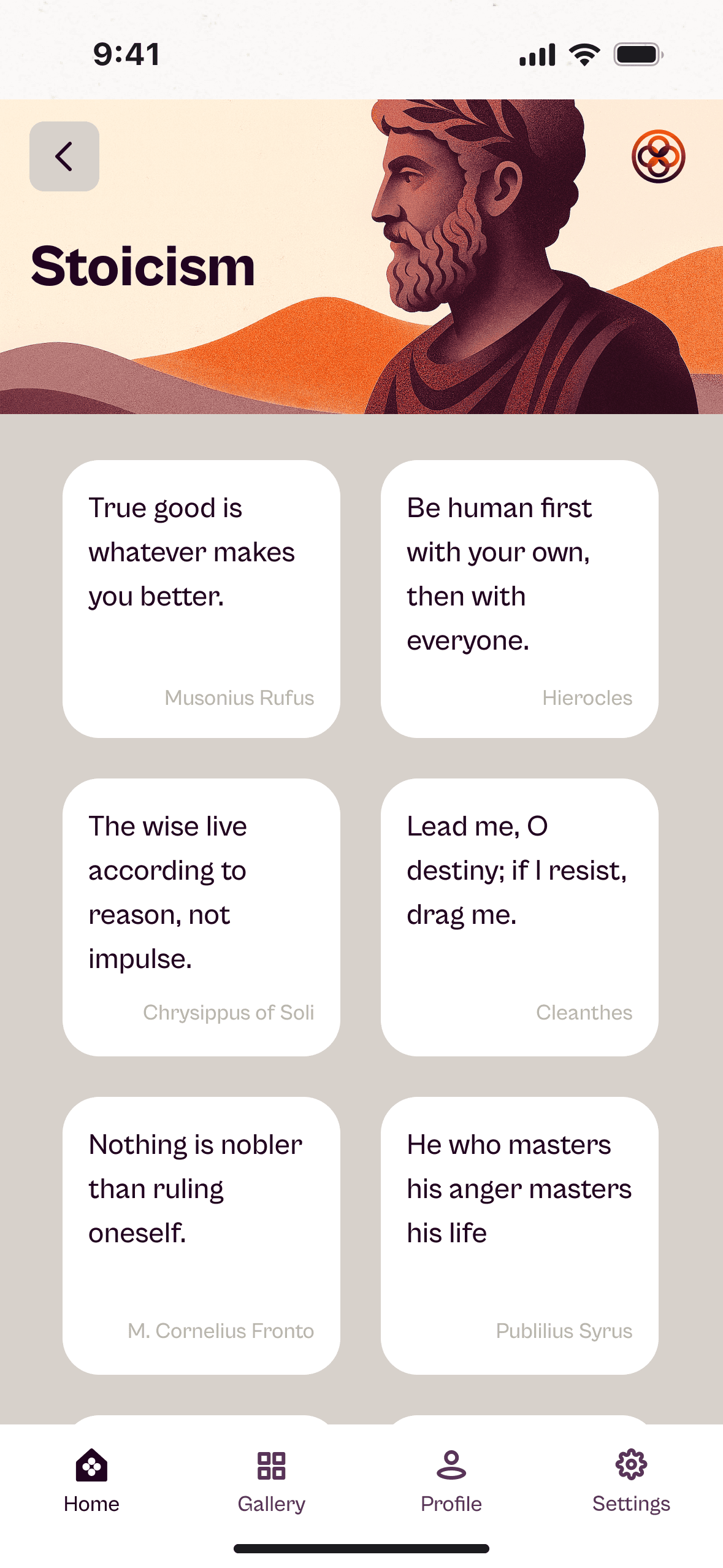
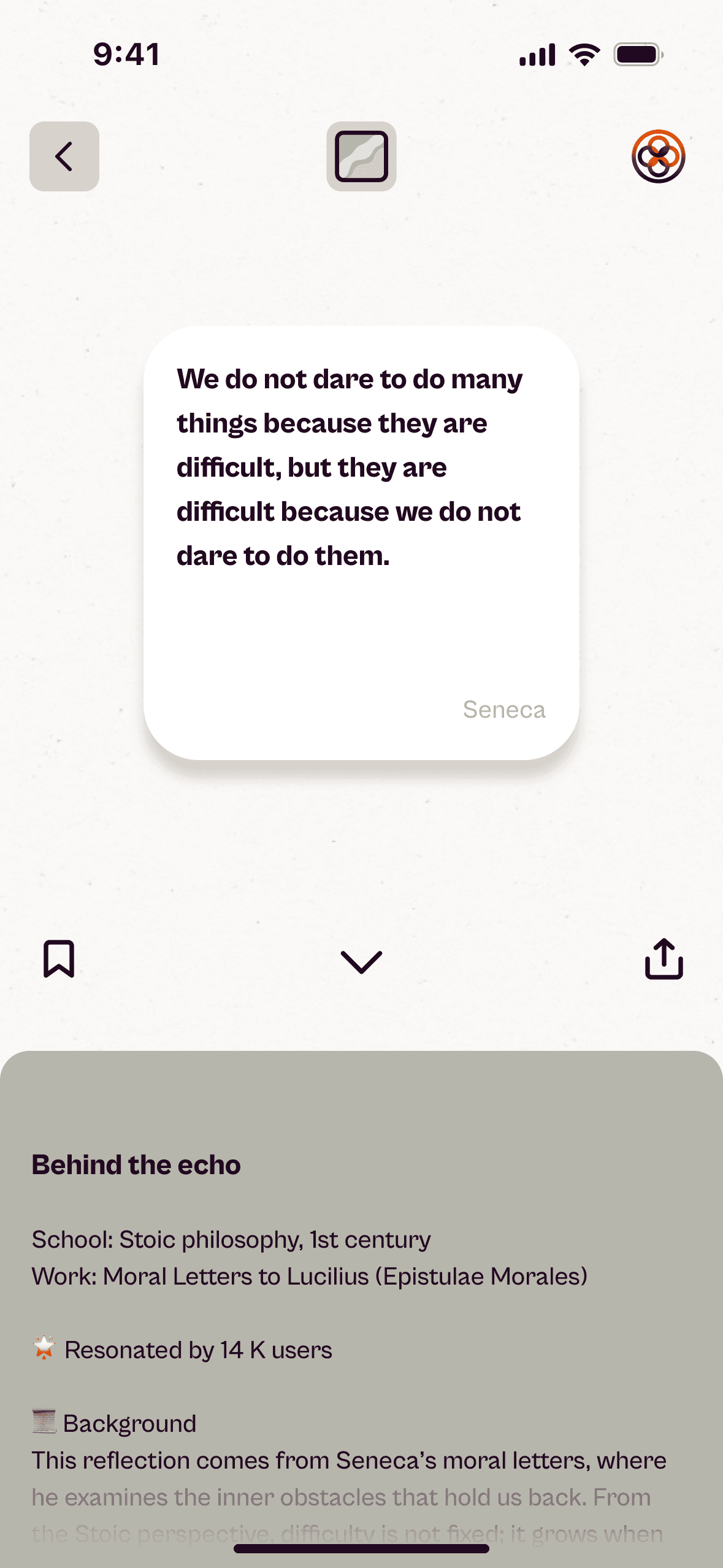
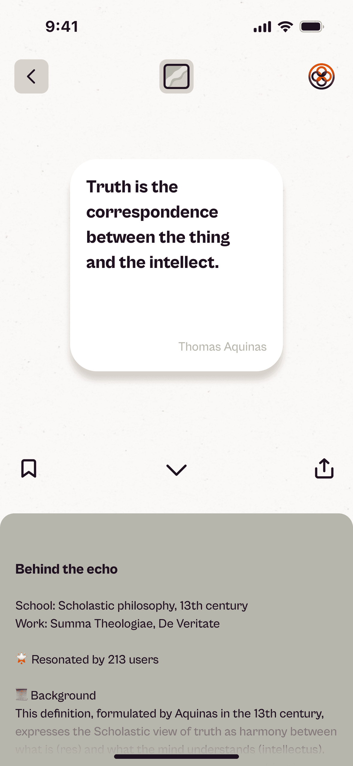
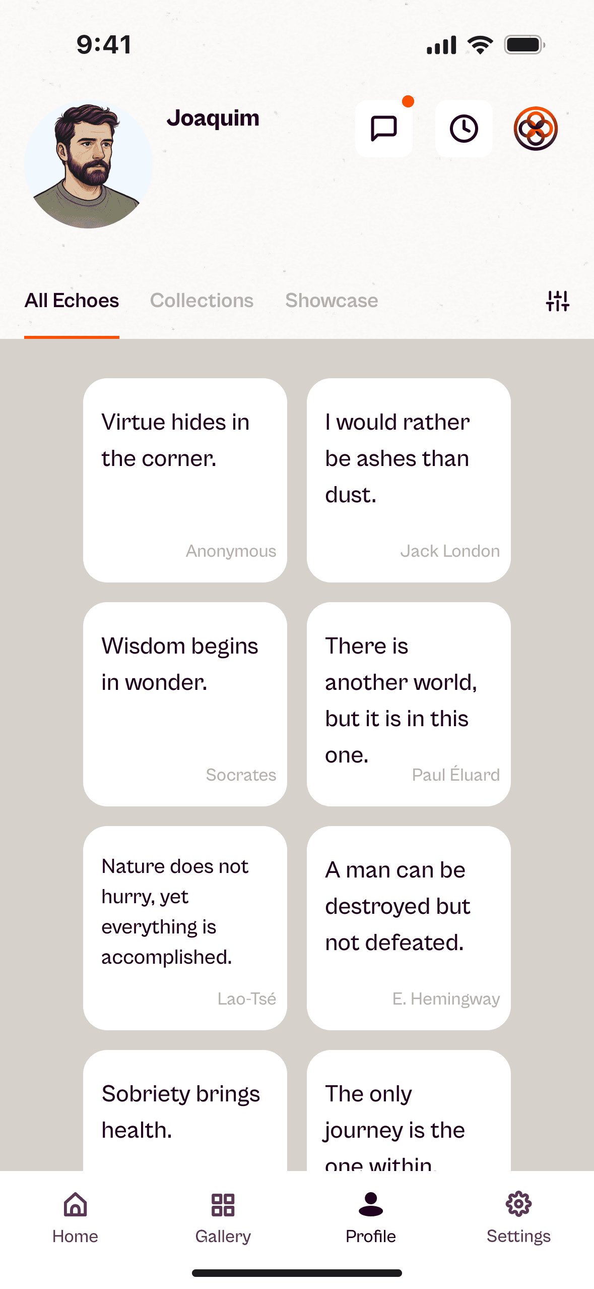
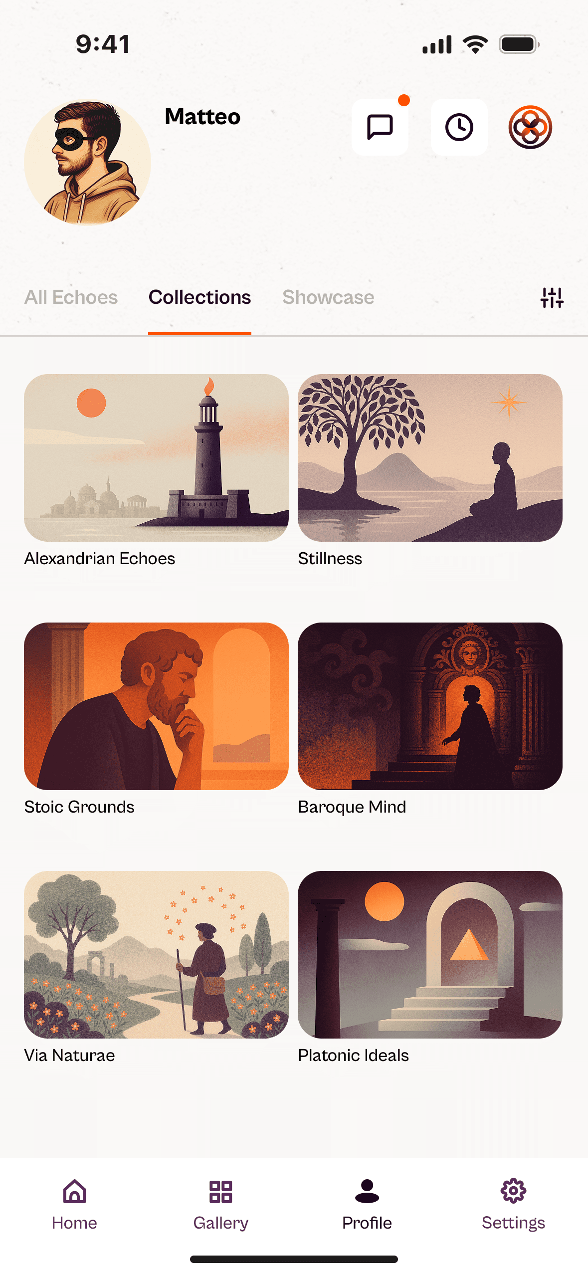
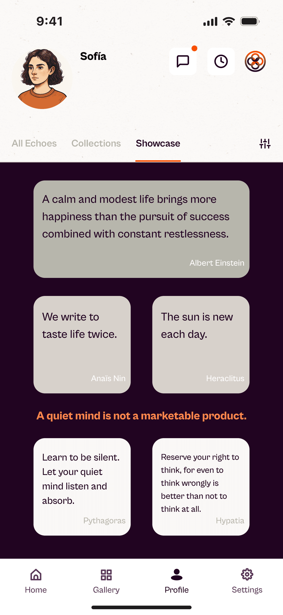
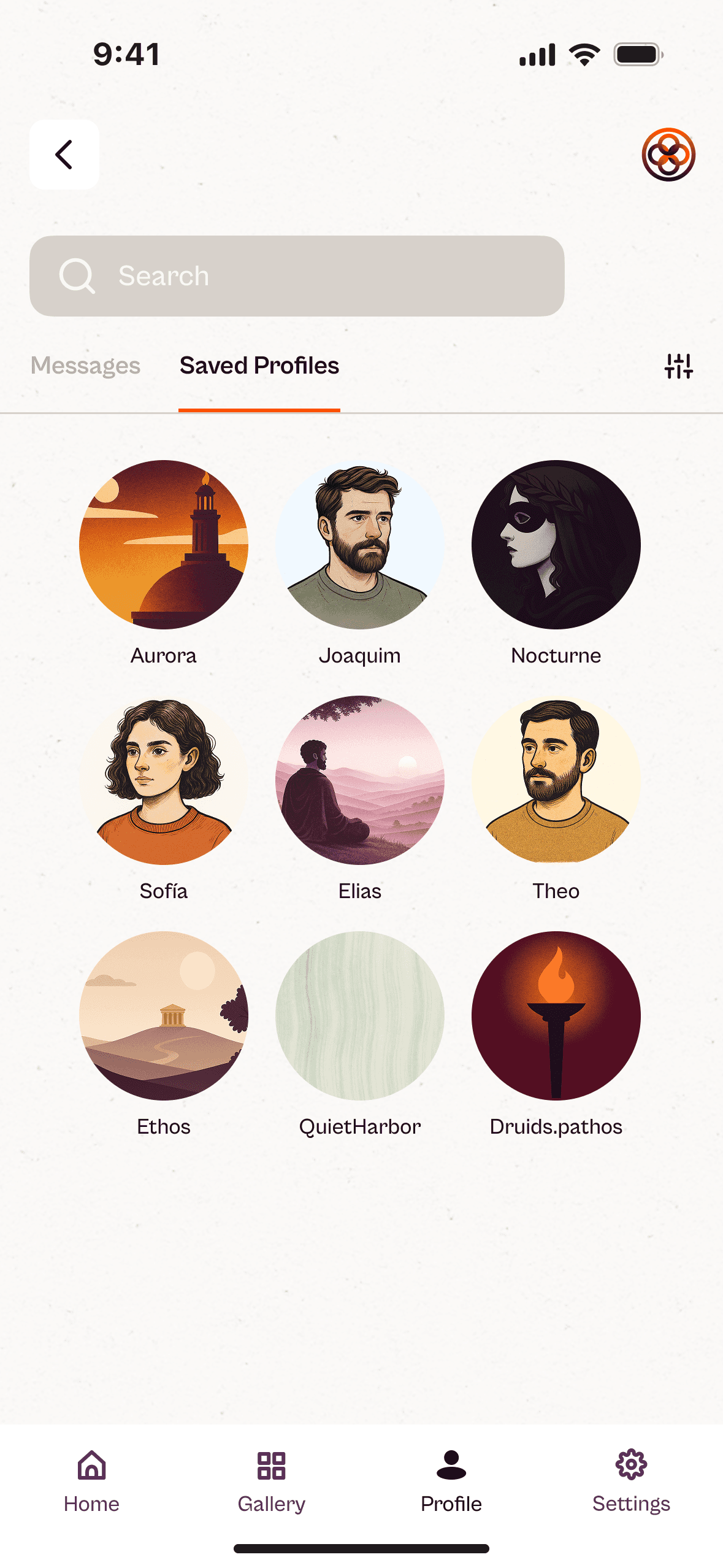
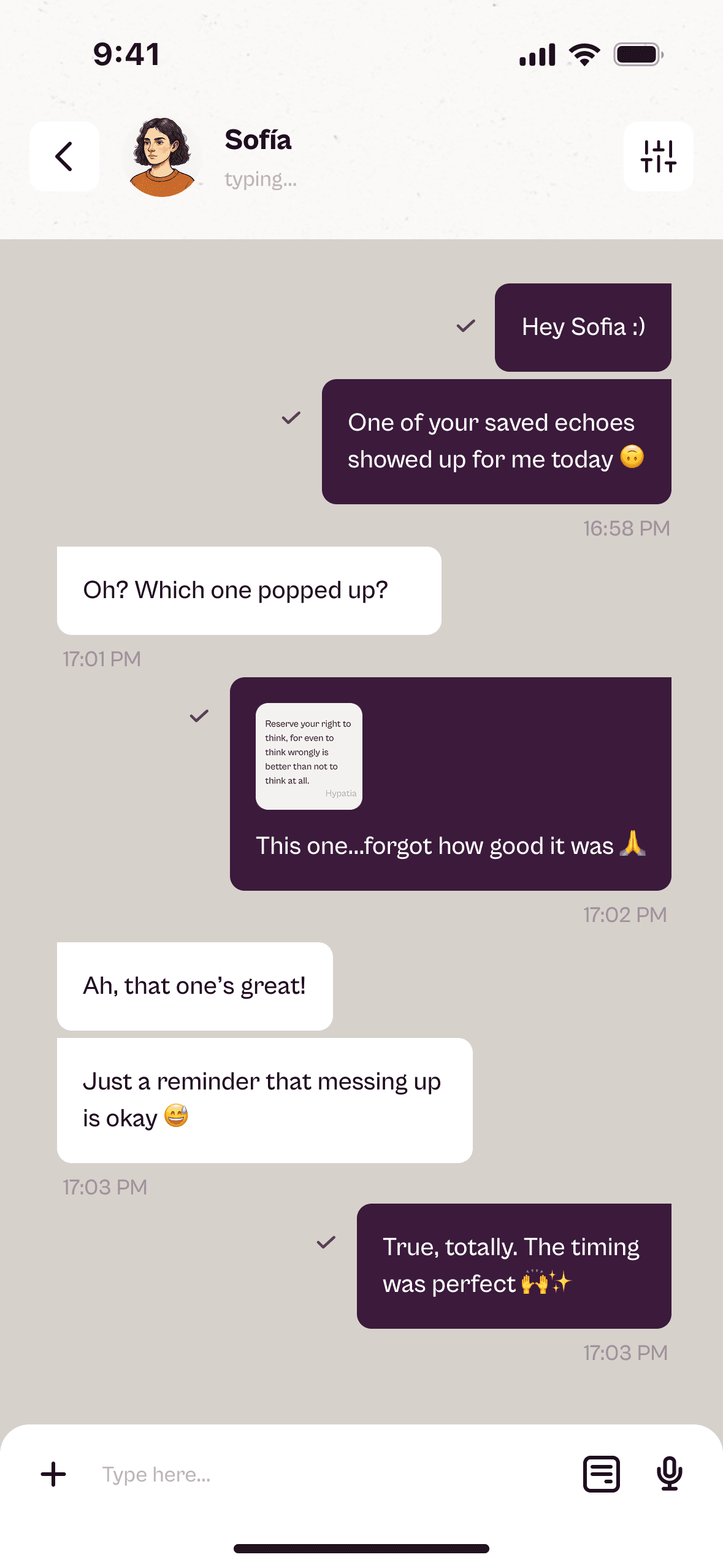
Thus was born Echoes : an app to explore, save, and share authors’ quotes, called echoes, as fragments of timeless wisdom. It works as a living archive where users can discover ideas, build their own mental refuge, and connect without metrics or exposure.
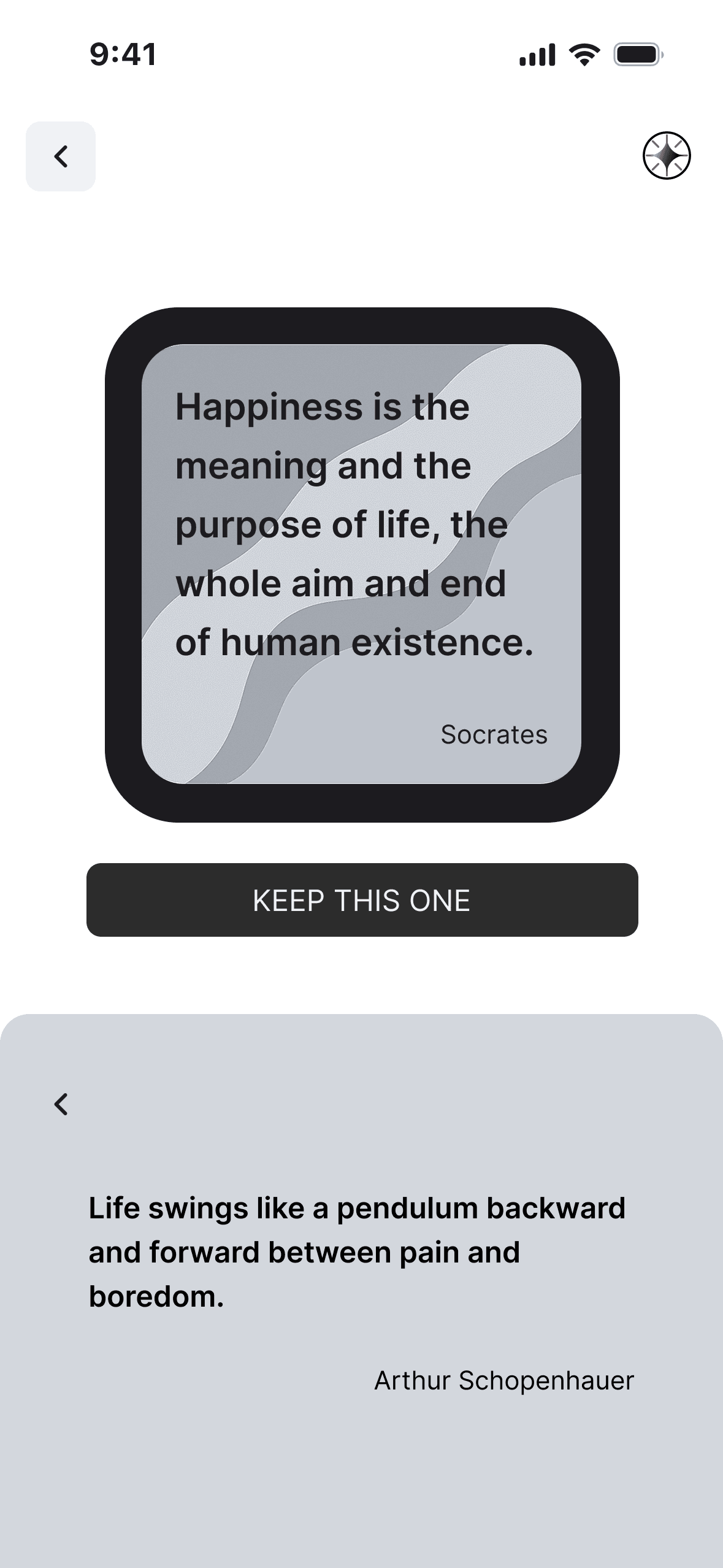
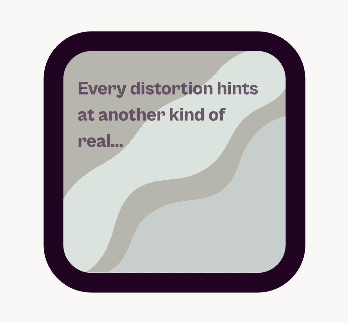
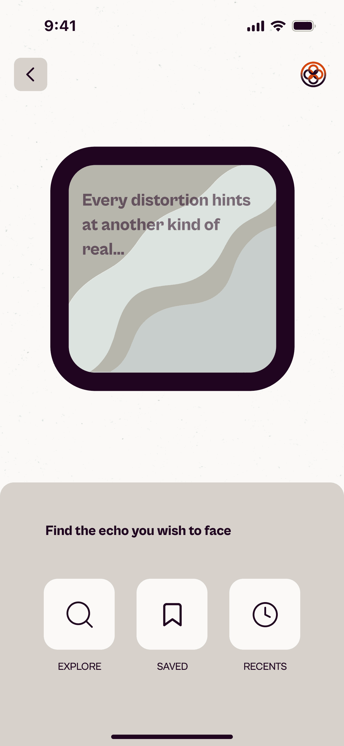
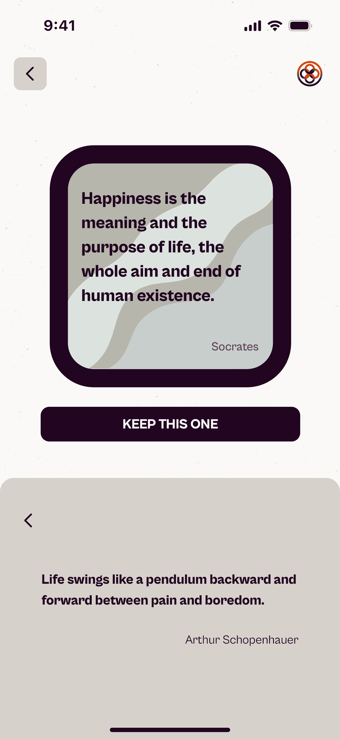
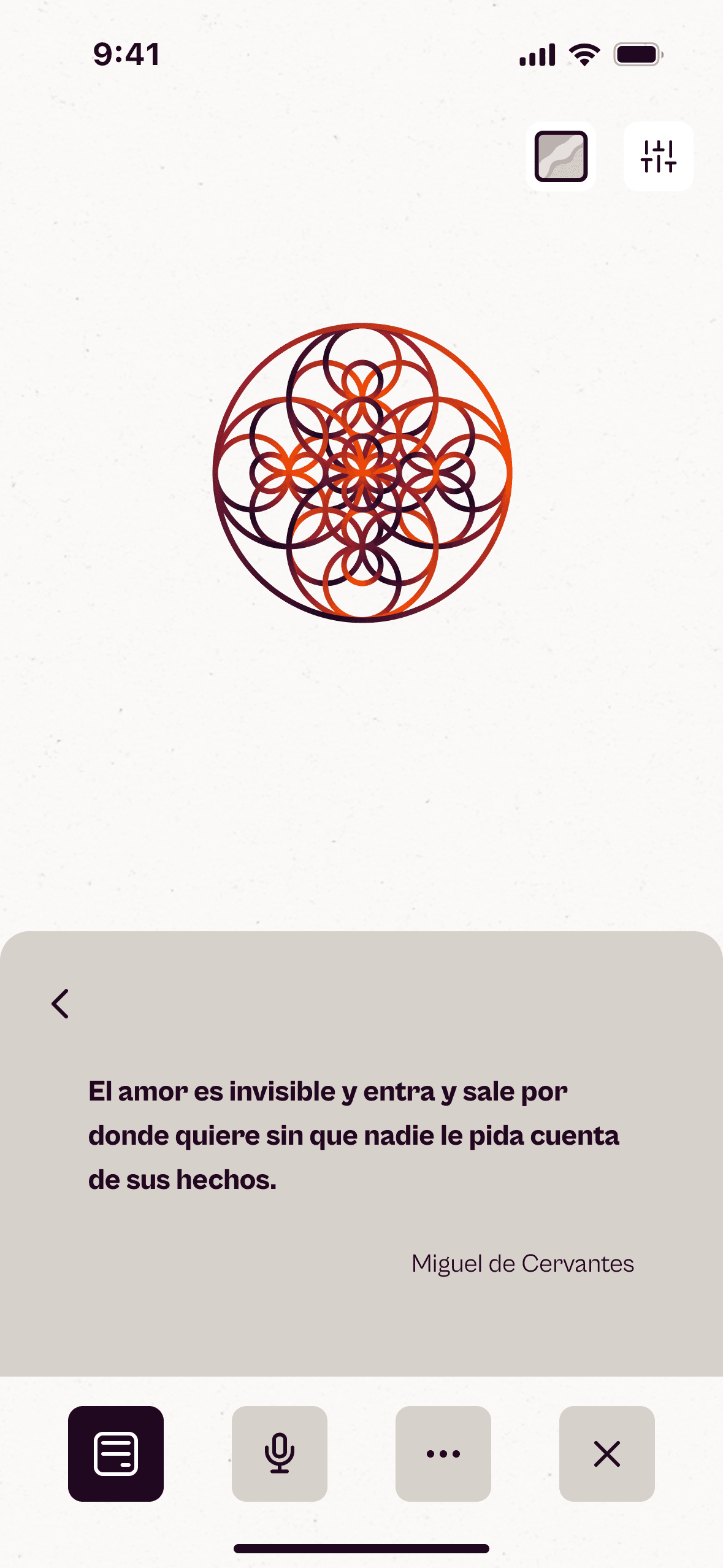
To encourage critical thinking, the Distorting Mirror feature suggests an echo whose idea contrasts or complements the selected one, broadening perspectives and reducing polarization. Echoes is not just a quotes app, it is a space to recover attention and authenticity amid the contemporary noise.
Site Map
The Site Map provides a structured view of Echoes’ architecture.
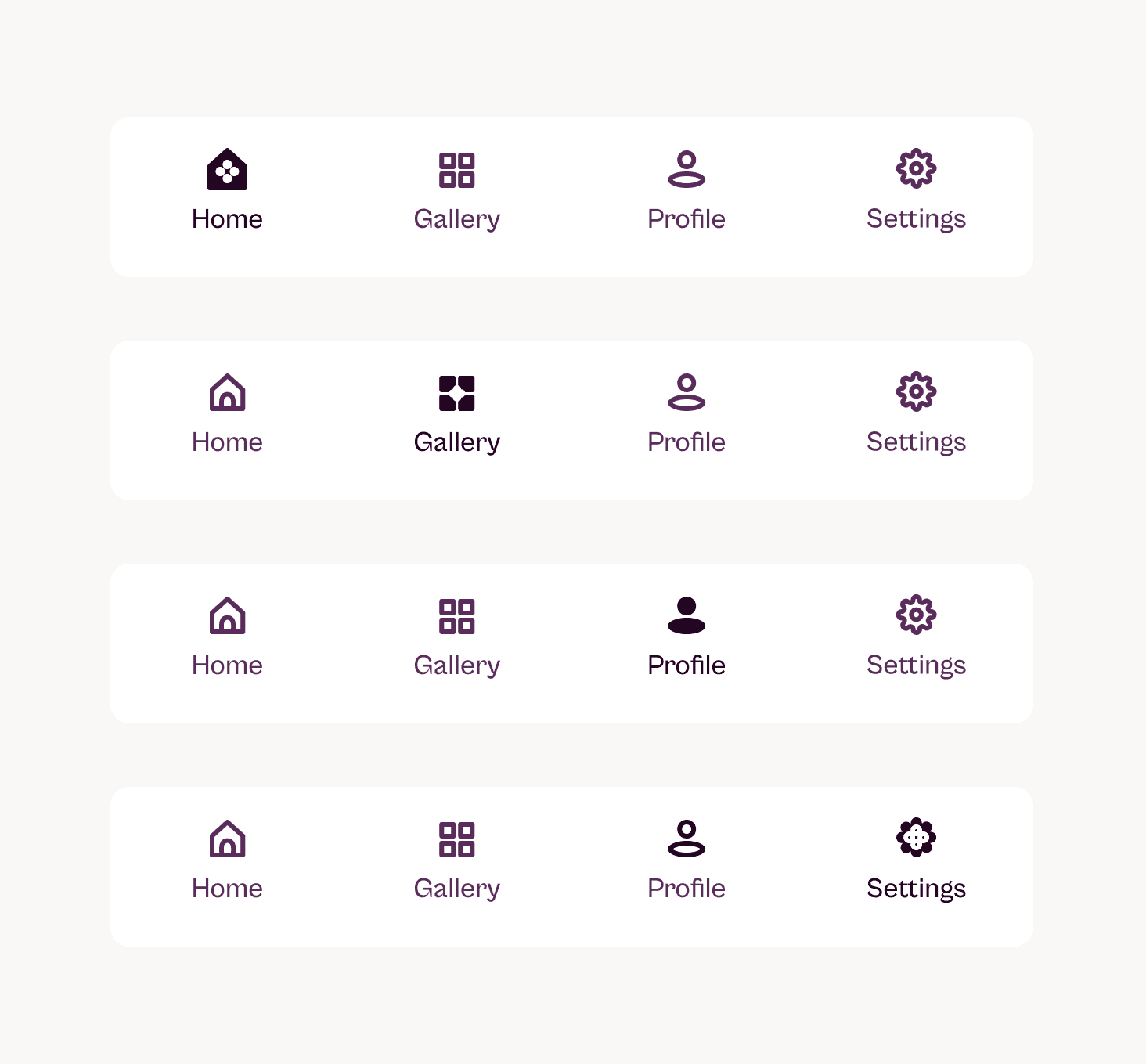
It organizes the main screens—Home, Gallery, Echo Details, AI Chat, Profile, and Settings—and shows how the different areas of the app connect. Its goal is to reflect the product’s clear and simple navigation while preserving its serene visual and functional flow.
User Flow
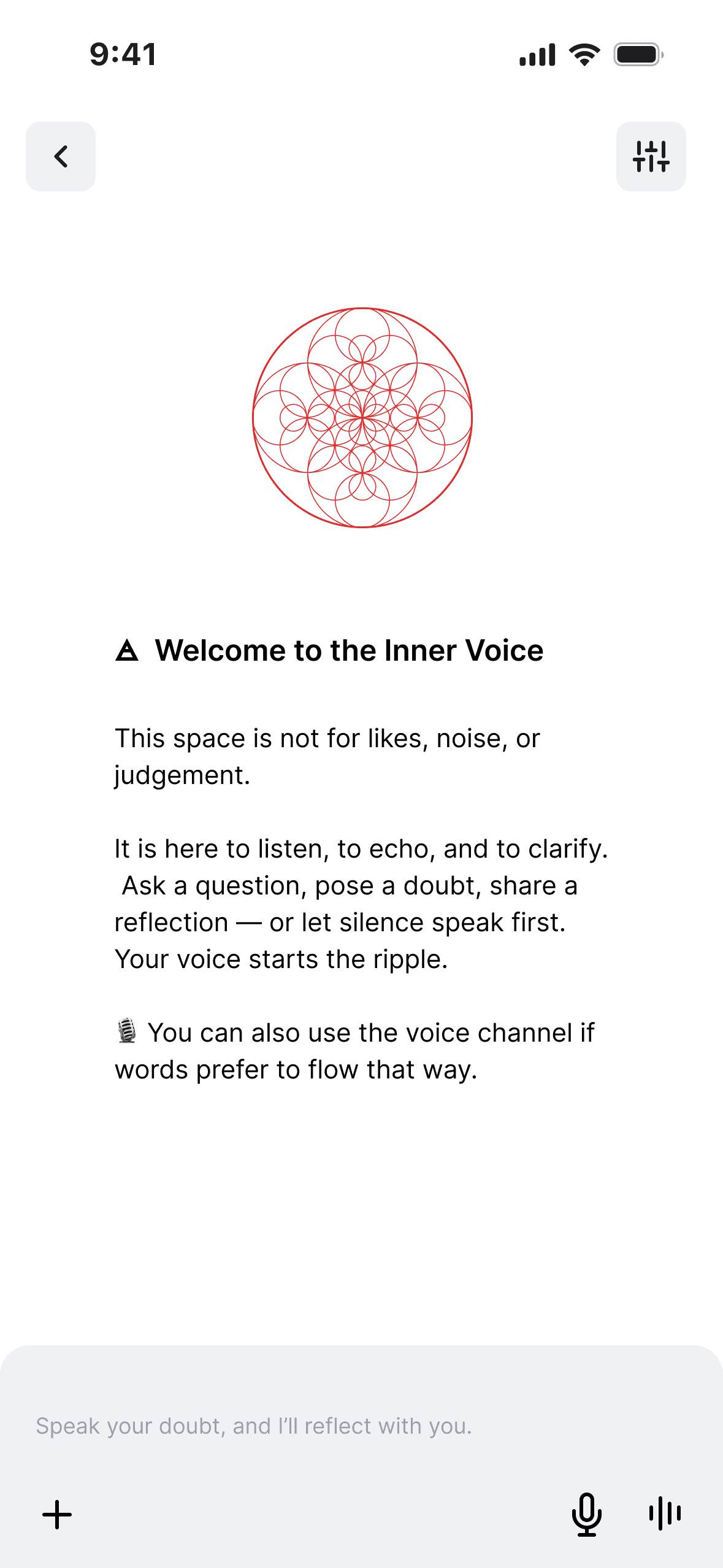
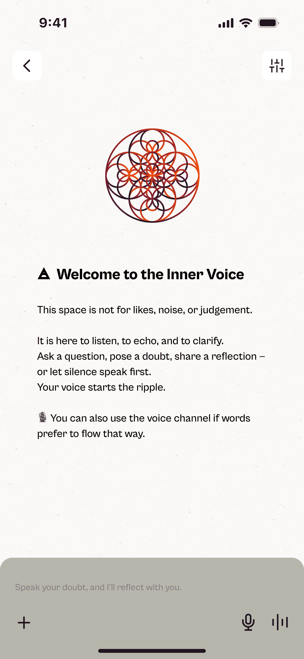
To translate the concept into a functional experience, a User Flow was designed to organize the key decisions and paths. Each piece of content, whether a quote or a fragment, is called an echo, the core of the application. The flow illustrates how a user discovers an echo, opens it in detail, saves it, organizes it, or uses it as a basis for reflection with the integrated AI. It also includes the Distorting Mirror, which suggests contrasting echoes to stimulate critical thinking.
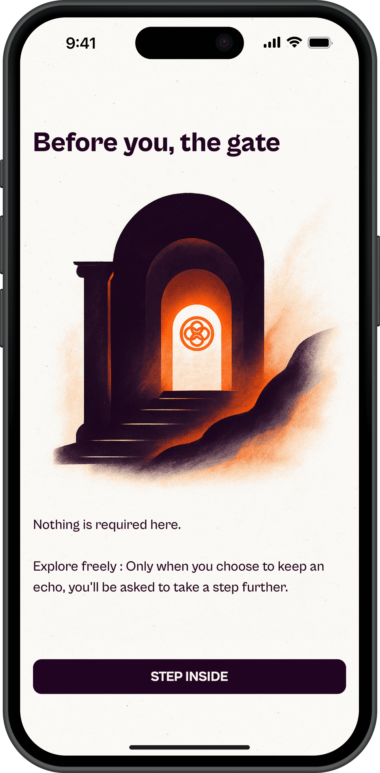
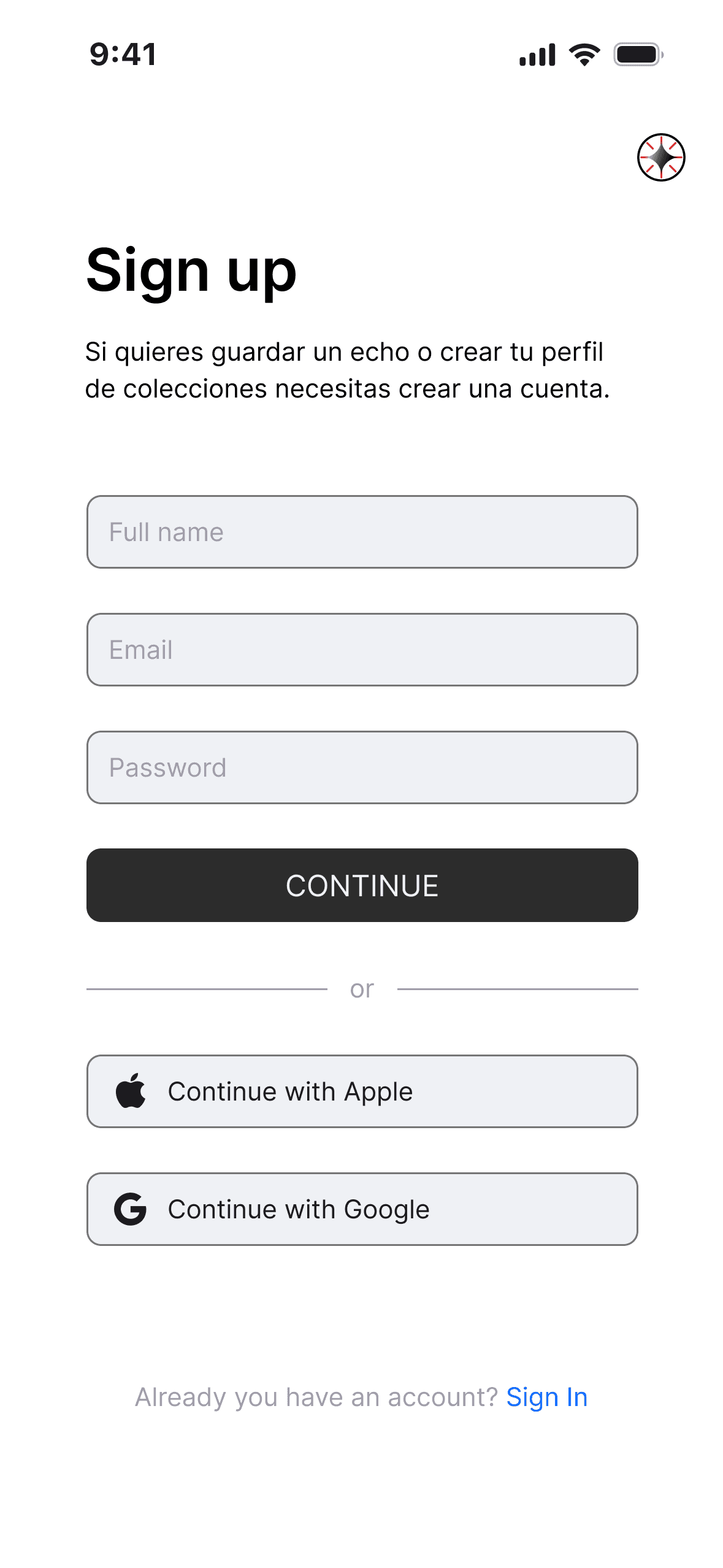
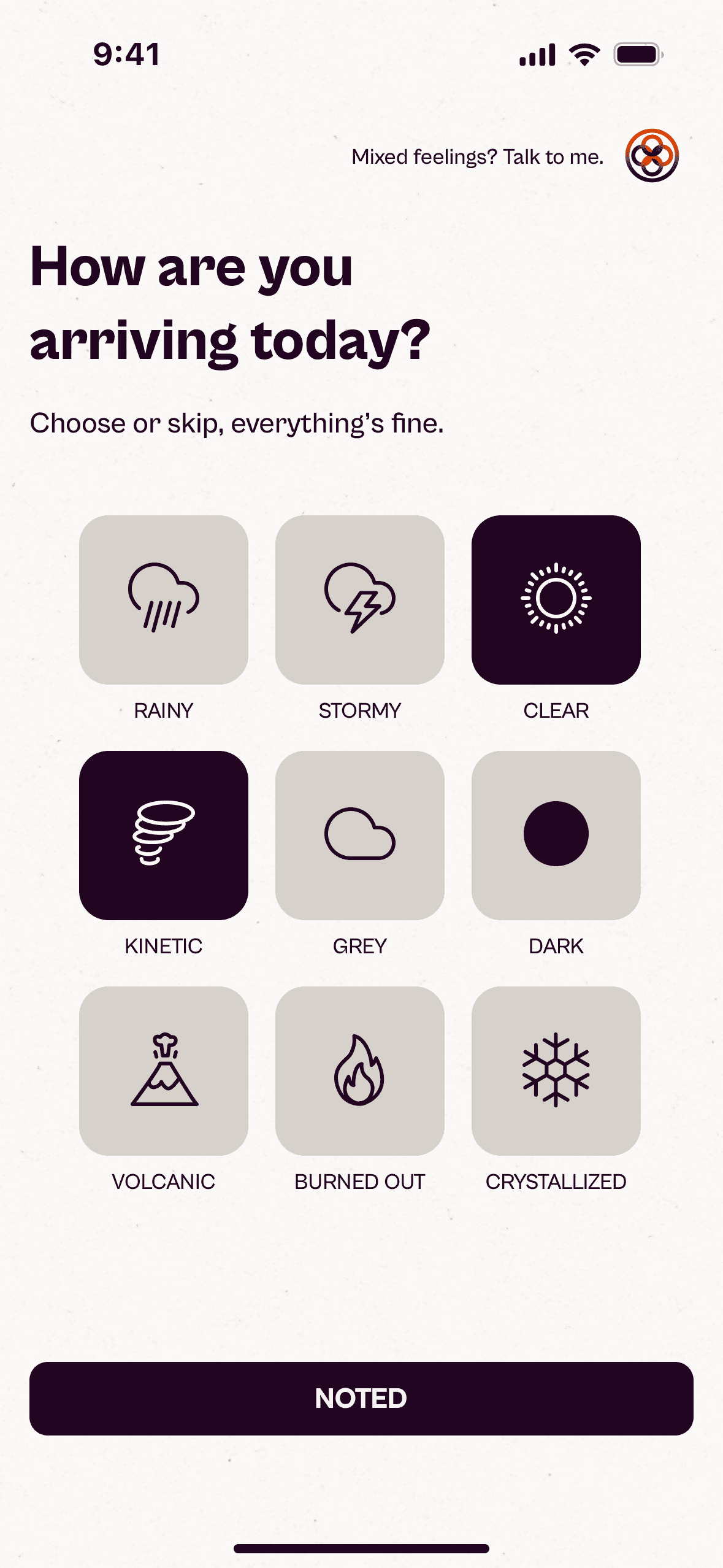
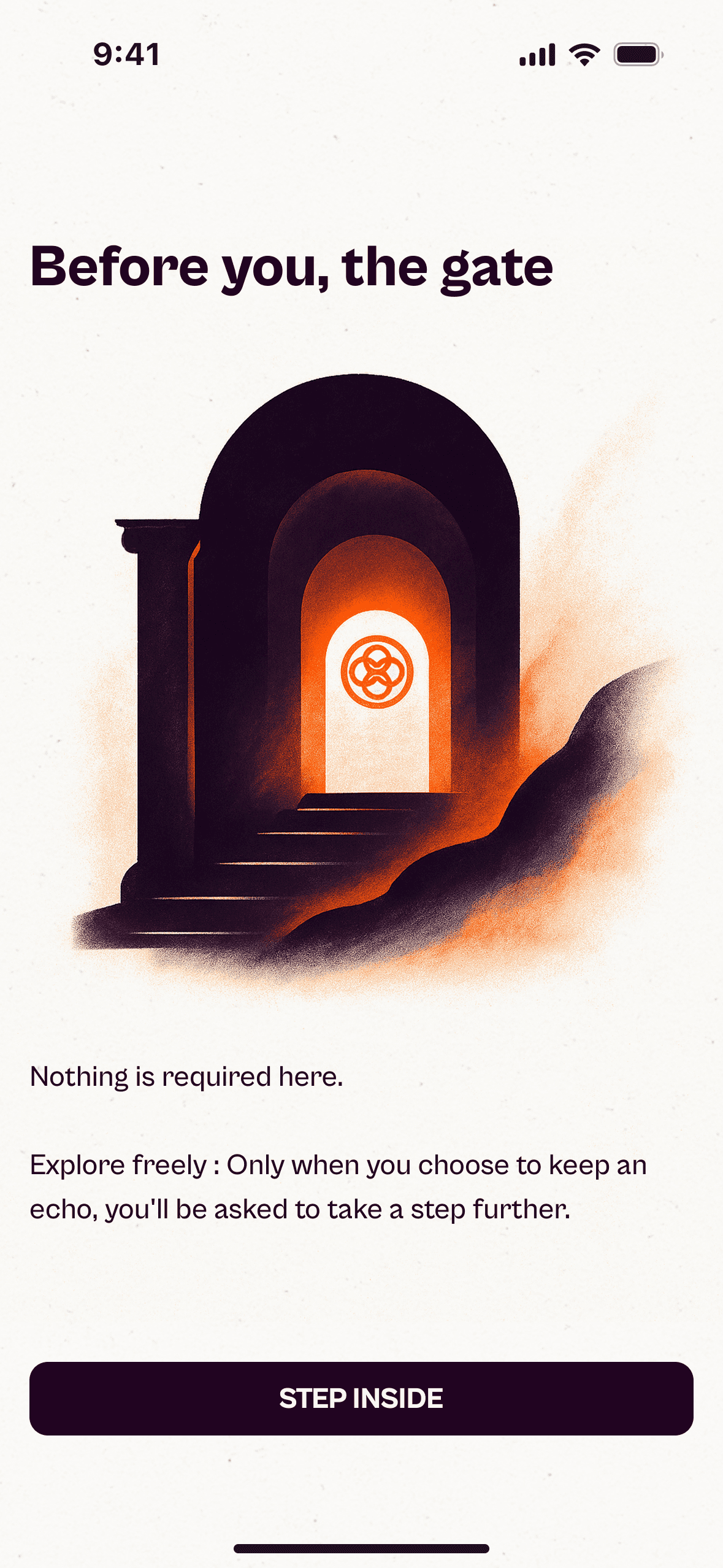
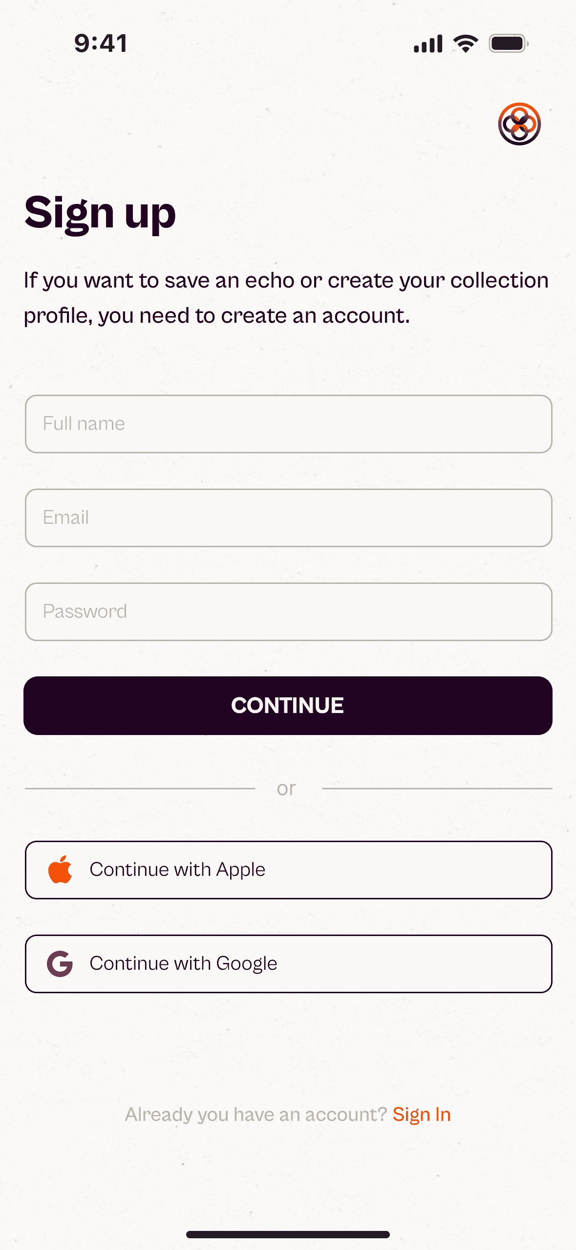
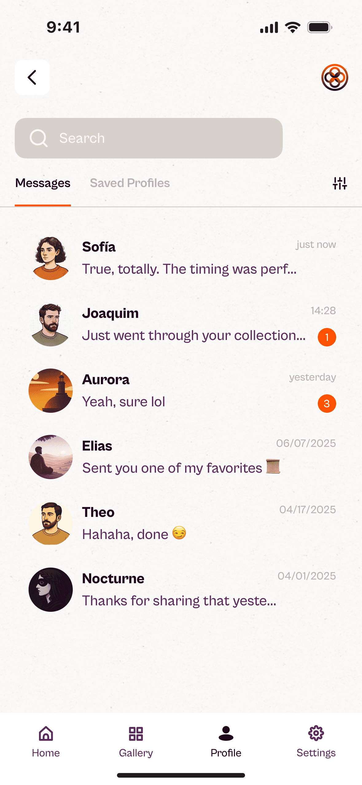
Another essential aspect is the delayed sign-in : users can explore freely before registering, reducing initial friction, improving retention, and keeping the experience calm. Finally, social activity such as messages and notifications remains discreet within the profile, preserving the serenity of the main interface. Overall, the User Flow shows how Echoes balances introspection and functionality without sacrificing clarity or peace.
In this phase, the concept began to take visual form. After defining the functional structure in Define, the next step was to explore how to translate Echoes’ core values —calm, focus, and depth— into a coherent, sensory experience. From the first sketches to the foundations of the visual system, this stage became a search between editorial clarity and digital balance.
Low to Mid-Fidelity Wireframes

AI Chat
Home + Distorting Mirror

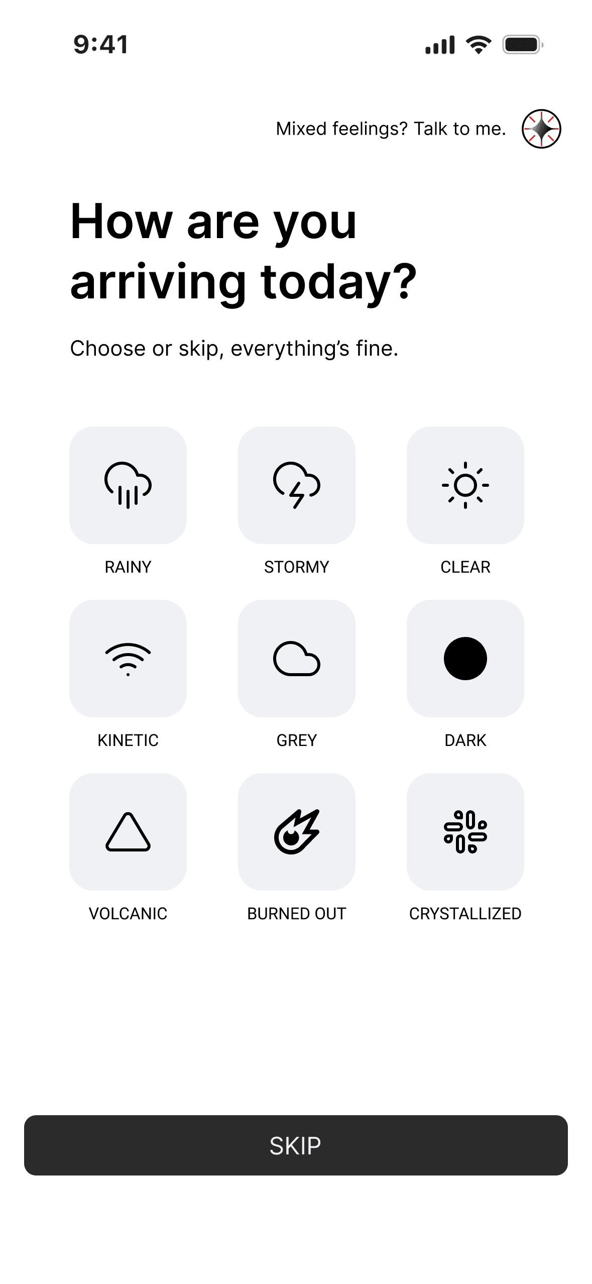
Onboarding

Profile

An early concept allowed users to write and submit their own echoes, which would be reviewed before publication. While it encouraged participation, it also risked turning the app into a performative space, distancing it from its contemplative purpose. The idea was ultimately discarded to preserve Echoes as a curated archive of timeless wisdom — not a competitive social network.
Mid-Fidelity Wireframes – Connecting structure, navigation and rhythm into a clear experience

Branding
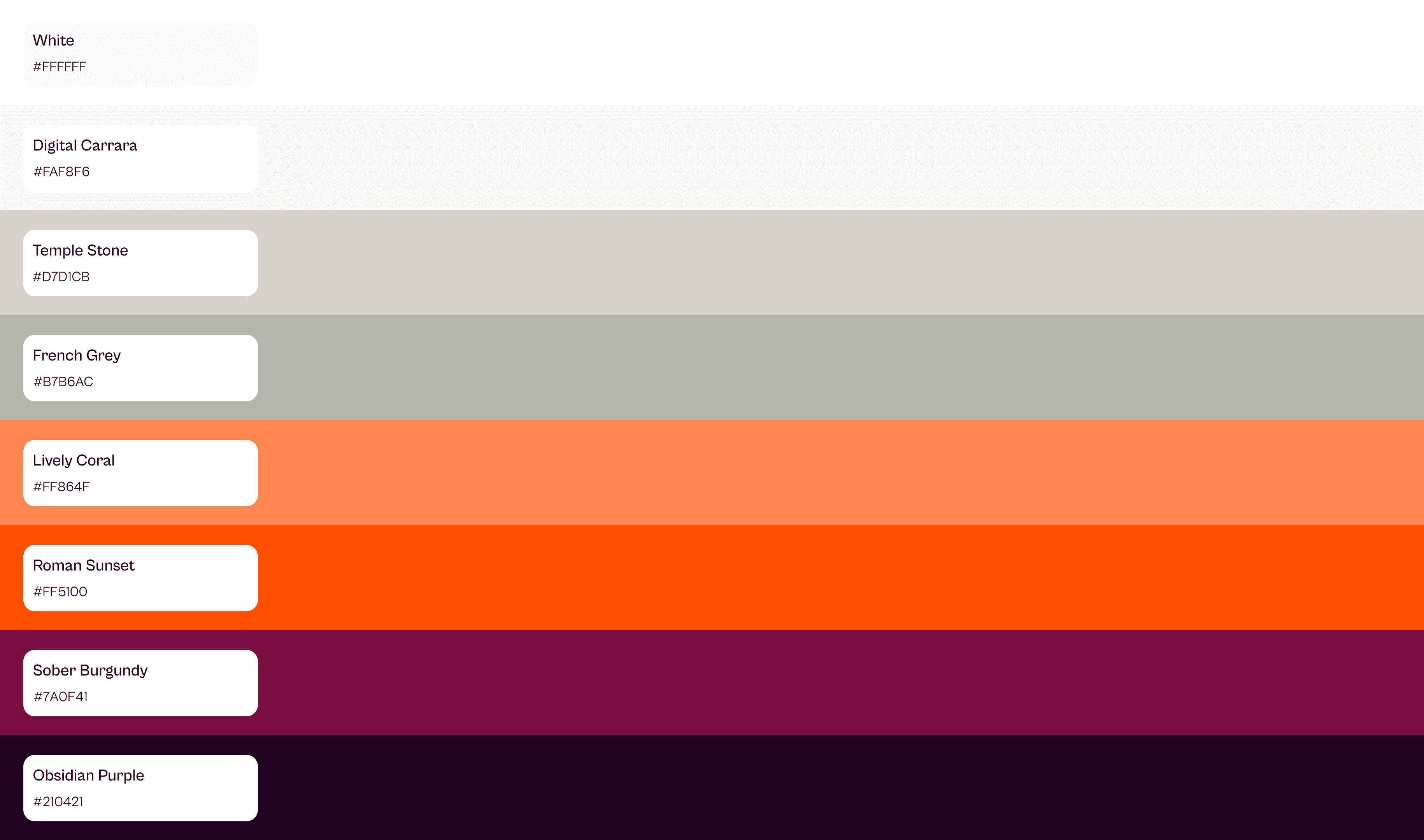
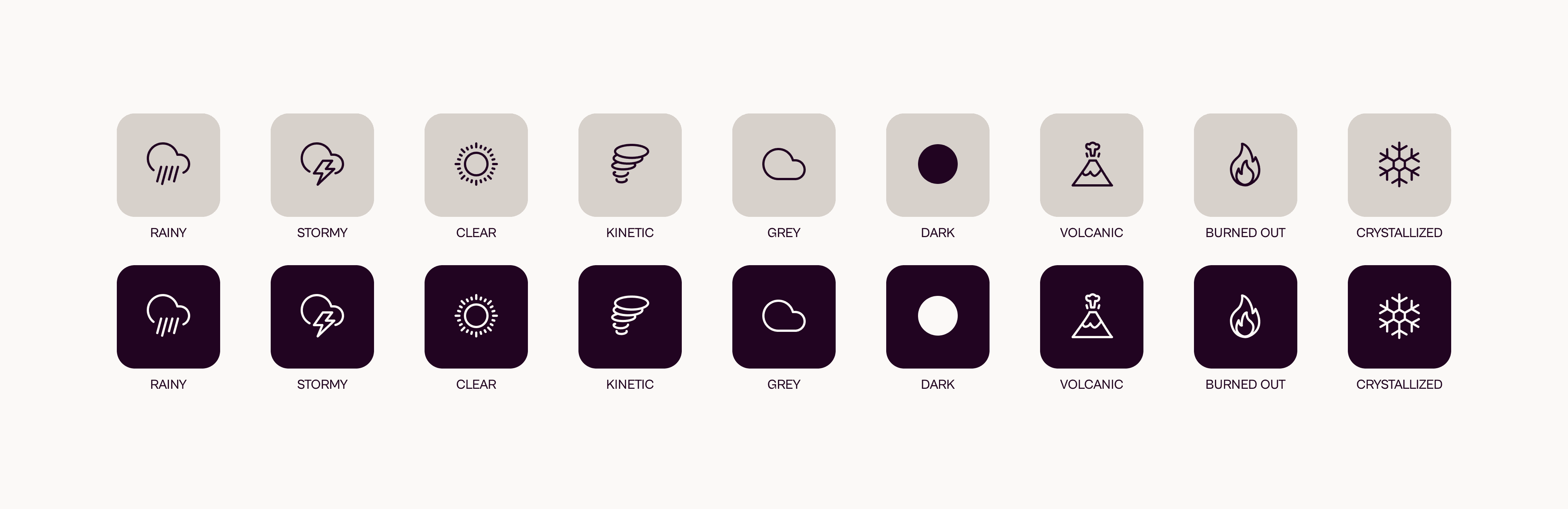
The color palette of Echoes conveys calm, humanity, and introspection. It is structured in three layers: stone tones that evoke serenity and clarity; warm hues inspired by Greco-Roman sunsets that bring emotion and emphasis; and deep burgundy–purple shades that introduce mystery and a touch of classical solemnity. Together, they create a serene, intimate, and timeless visual atmosphere.
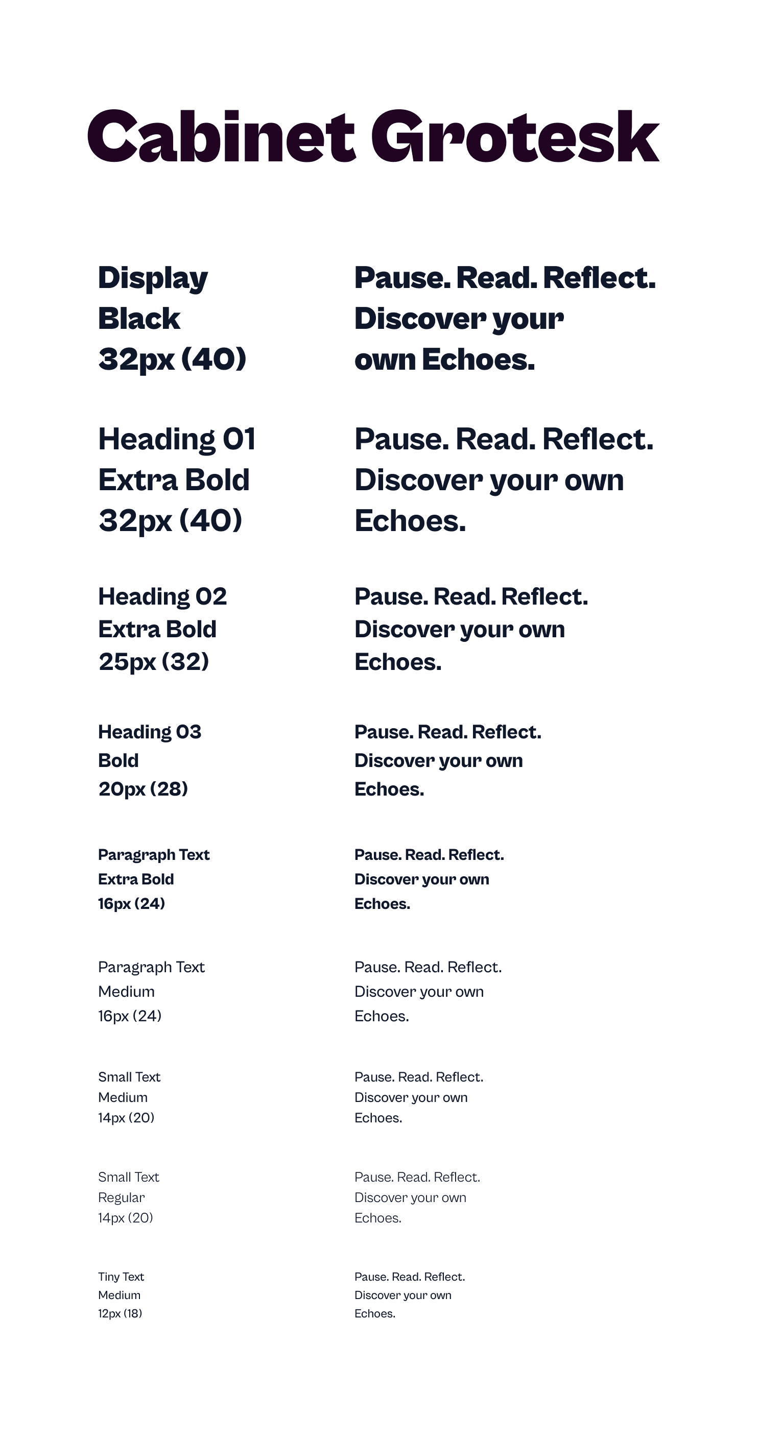
The Cabinet Grotesk typeface anchors the identity with understated elegance and quiet strength. Its contemporary, humanist design combines modern clarity with timeless warmth, offering character without ostentation and a balanced editorial presence.
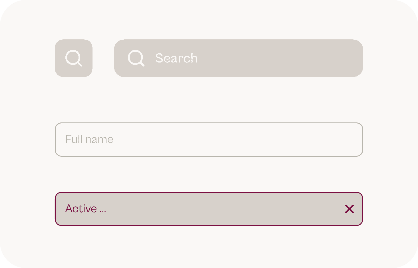
UI Design & Components
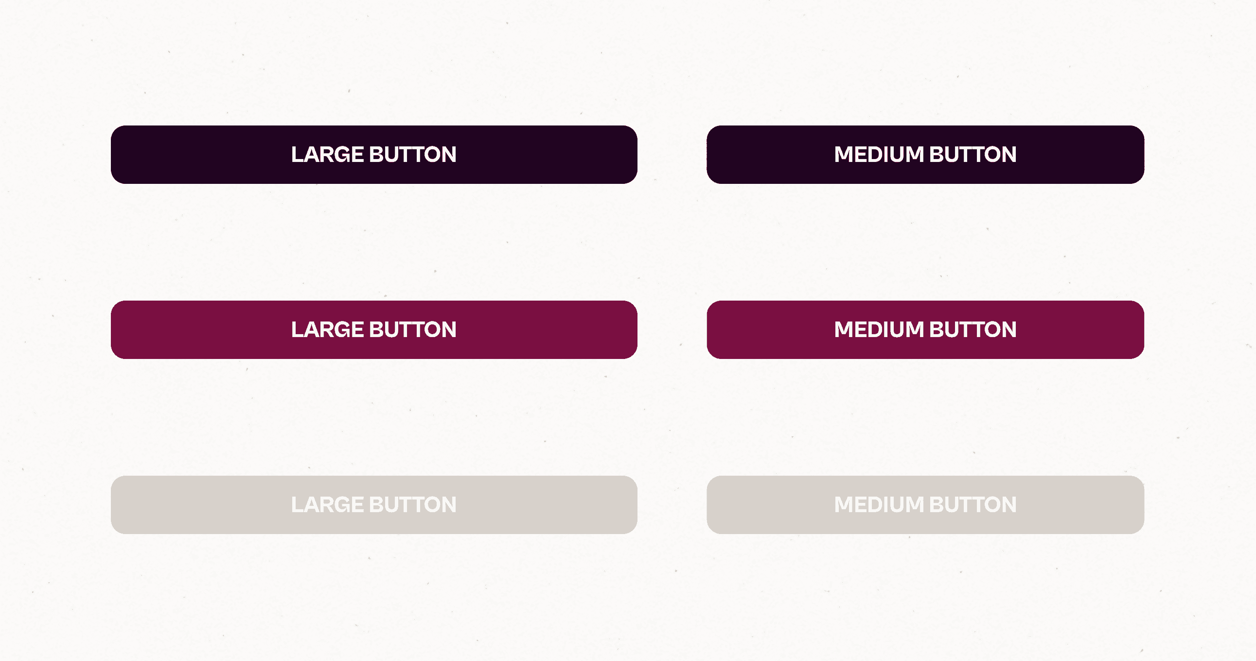
The UI Kit consolidates Echoes’ visual identity into interactive components. Each element —from buttons to cards and icons— was designed to preserve clarity, rhythm, and serenity across the entire experience.

Accessibility Note
Echoes’ interface was designed with clarity, legibility, and visual comfort in mind.
1
Most color combinations meet WCAG AA contrast standards, ensuring readable hierarchy and comfortable interaction across devices.
2
The palette was also reviewed under color-blind simulations to maintain distinguishable tones.
3
Typography and spacing follow accessibility best practices, with a minimum text size of 12 px and generous line height for fluid readability.
Prototype
In this phase, the design becomes fully real. Visual decisions evolve into final screens, microinteractions, and animated flows that show how users experience Echoes in their daily use. Every transition and gesture is crafted to preserve calmness and readability as the foundations of the experience.
Hi-Fi in Motion

A walkthrough of the first Echoes experience: from the onboarding to the Home, exploring inspiration, diving into the Echo of the Day, and accessing the profile through a discreet, non-intrusive sign-in.
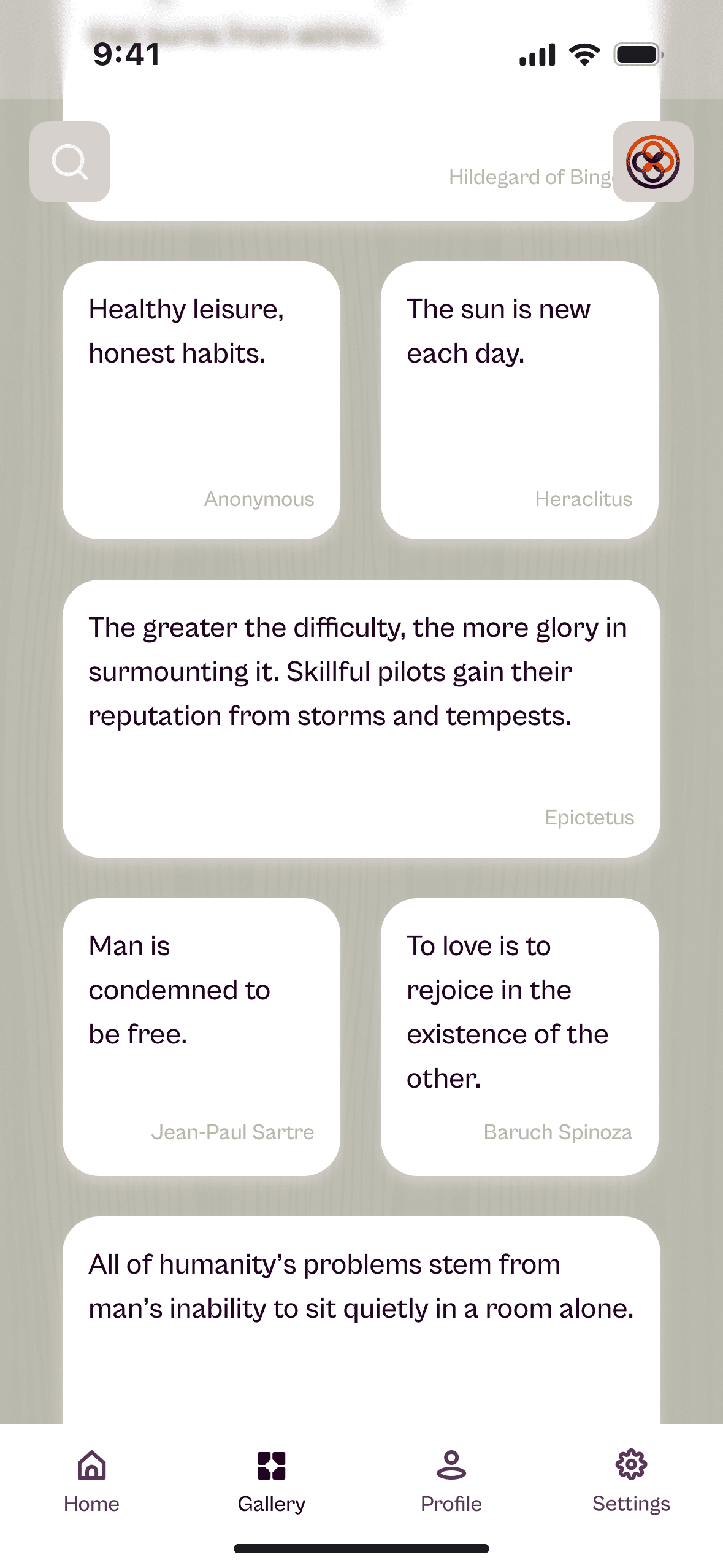
A glimpse of the Gallery in motion —a calm river of echoes— and a reflective conversation with the AI before returning to the Home.
The Distorting Mirror in action: selecting an echo, passing through the intermediate screen, and revealing an opposing or contrasting idea.
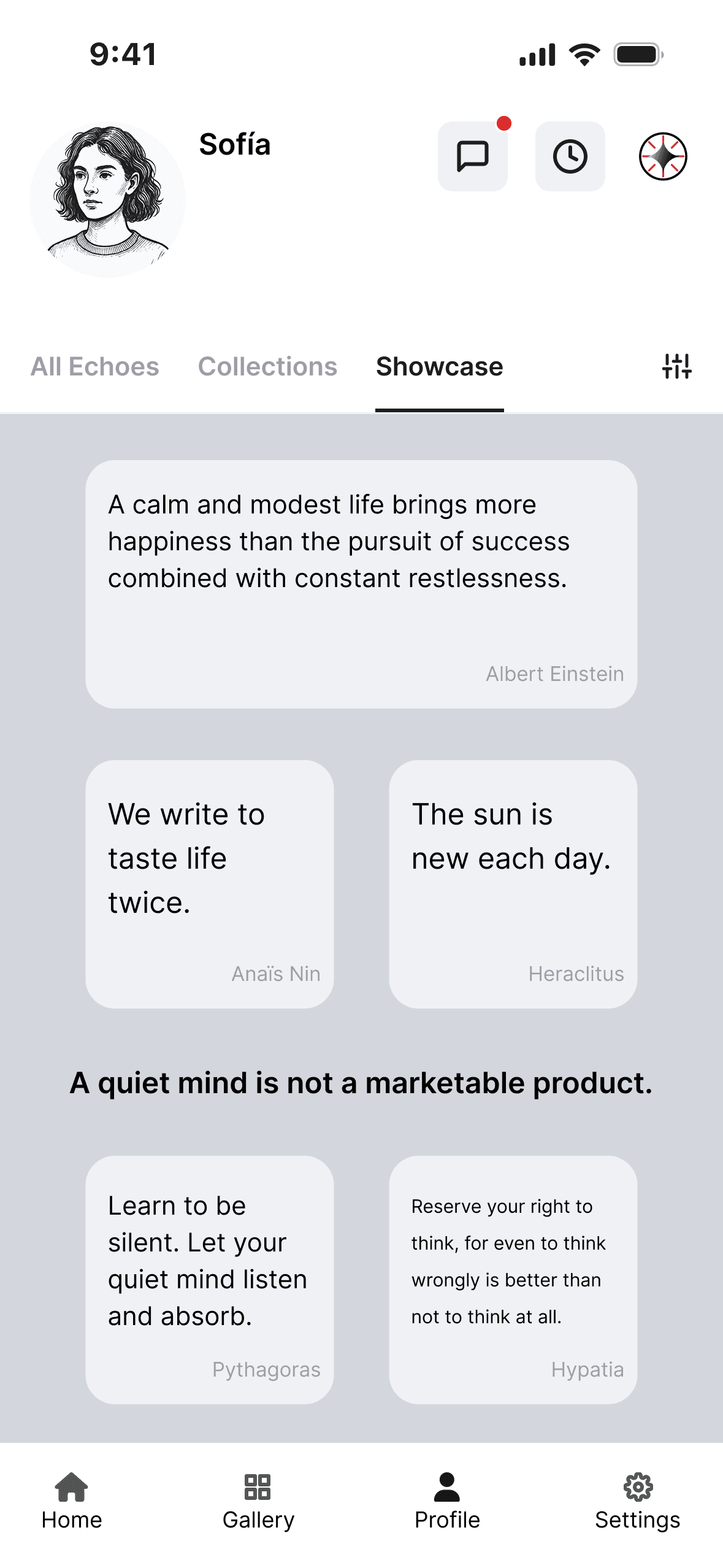
A tour through the user profile: saved echoes, personal collections, the public showcase, and the discreetly integrated social section —chats and contacts.
Outcome & Results
Project Conclusion
Echoes proposes a calm, intimate, and reflective digital experience. An app designed to help users pause, breathe, and encounter ideas that accompany, challenge, or illuminate the present moment. From a product perspective, Echoes demonstrates that there is growing space for services rooted in inner well-being, emotional low-friction, and a slower, more meaningful form of cultural consumption.
Expected Benefits
Human / social / cultural
1
Encourage daily habits of introspection.
2
Reduce anxiety caused by digital noise and overexposure.
3
Soften polarization by promoting nuance, coexistence of ideas, and critical thinking.
4
Enable more authentic, non-performative connections.
1
Clear differentiation in a market dominated by compulsive-engagement models.
2
Natural alignment with digital well-being and slow app trends.
3
Potential for subscription-based models: curated echo collections, premium content, AI features.
4
Opportunities for collaboration with cultural, educational, or philosophical institutions.
Hypothetical KPIs
(proxy metrics)
% of users taking a reflective pause per day.
Indicator of emotional resonance.
Users who complete Distorting Mirror
Activity in the Inbox without generating feed dynamics.
How well Echoes integrates into users’ routines.
Usage of the conversational companion as a space of support.
Learnings
What I would improve
·
With more time, I would expand the possibilities of the Gallery (touch control, alternative modes, richer behavior) and strengthen the gentle social layer, allowing connection without turning the experience into a noisy space.
What I learned
·
This project confirmed that atmosphere —calm, rhythm, tactility— is crafted just like functionality: through precise decisions, intention, and consistency.
·
It also reinforced the importance of testing and visualizing key interactions throughout the process, not only at the end, to ensure the emotional experience evolves alongside the structural design.
What I want to
explore next
·
This project confirmed that atmosphere —calm, rhythm, tactility— is crafted just like functionality: through precise decisions, intention, and consistency.
·
It also reinforced the importance of testing and visualizing key interactions throughout the process, not only at the end, to ensure the emotional experience evolves alongside the structural design.